Themes and rendering
Themes are role-based. Widgets resolve named roles from their attached
context, and applications can begin with ui::make_classic_theme before
supplying a different Theme. A subtree or window can override the roles it
uses without changing process-wide state. The Classic scheme's visual
baseline (frame glyphs, window controls, shadows, menus, the status line,
dialog controls and every role's colours) is specified cell by cell, and a
gate in the development tree holds the pinned Classic goldens to that
specification.
View::set_theme_override gives one window — its frame and everything inside
it — a theme of its own while the rest of the application keeps the
application's. The Workbench example's Window → Console is a console on a
dark ground inside the classic workbench. Setting or clearing an override
after the subtree is on screen repaints the whole subtree, windows and other
retained surfaces inside it included, as Application::set_theme repaints the
whole tree
(an_override_set_after_the_first_frame_repaints_every_window_inside_its_subtree
in tests/test_theme_override_golden.cpp); the theme editor's live preview is
such an override. The override script
(tests/test_theme_override_golden.cpp) pins two overlapping windows, the
front one overridden with a different built-in scheme, under each of the four
application schemes (tests/golden/theme_override_{classic,dark,light,mono}.dump),
and checks that the overridden window draws exactly what its scheme draws when
that scheme is the application's own.
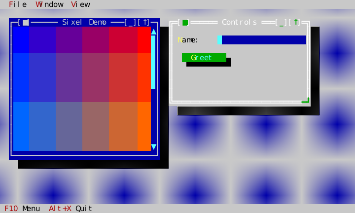
The Gallery shows both document and dialog frame families in one real frame:
widget state changes
  -> affected View invalidates
  -> Application composes the View tree
  -> Presenter emits changed terminal cells and raster overlays
You normally set a theme once during application construction, as every example does:
GalleryApp::GalleryApp(ui::Application& app) : app_(app), roles_(ui::intern_standard_roles(app.roles())) {
    app_.theme() = ui::make_classic_theme(app_.roles(), roles_);

    auto desktop = std::make_unique<widgets::Desktop>(app_.root().bounds());
    desktop_ = desktop.get();
    app_.root().add_child(std::move(desktop));
For a scheme change after the first frame, call Application::set_theme(new_theme)
and then run the next application step. The Gallery, Editor and Terminal
examples each offer the four built-in schemes as ordinary commands in their
View menu, whose handler is exactly that call. This invalidates the desktop, retained
window surfaces, and popup surfaces together so the visible frame adopts the
new roles. Directly assigning through theme() configures a theme before the
first paint; it does not request a repaint of retained surfaces.
The result is deterministic: clients supply services rather than having the UI
read wall-clock, locale, environment, or filesystem state behind their backs.
Paint calls are coordinated by Application::step()/run(); a client should
change widget state, not issue terminal escape sequences or manual repaint
loops. Graphics explains the one capability-sensitive surface.
The built-in themes distinguish two kinds of keyboard cue automatically.
ckv.hotkey accents a command chord in StatusLine and an & mnemonic in a
menu (red in Classic). ckv.label.mnemonic accents focus-changing labels,
buttons, checkboxes, and radio options inside dialogs (yellow in Classic).
Both preserve the receiving surface's background, so a highlighted menu row or
focused dialog control stays visually coherent.
Classic keeps action buttons and choice groups deliberately distinct: buttons use green faces, while radio and check-group selection surfaces use cyan. This prevents a persistent selection from reading as an immediate action. Editable one-line fields use the dark-blue input surface, with a light-cyan focused value, so form entry stays distinct from both static dialog text and the cyan choice surface. Dark and Light show the focused field on their focus and accent surfaces; Mono and High Contrast underline it. Focus is therefore visible on fields that draw no caret, such as a pick-only combo box or a shortcut field.
A disabled control draws through its family's disabled role:
ckv.label.disabled, ckv.button.disabled, ckv.input.disabled,
ckv.memo.disabled, ckv.option.disabled, and ckv.list.disabled. Each
keeps its family's surface and changes the text colour, so a disabled button
still reads as a button and a disabled field as a field. Every built-in
scheme defines them. A disabled control drops focus, hover, pressed, caret,
selection, and mnemonic accents. It keeps its content and state: a checked
box stays checked, and a list shows its cursor row on the muted inactive
selection. A tab strip uses ckv.tab.disabled
foreground while retaining its selected background. Views that set no value, such as dividers and document surfaces,
draw their unfocused state. Menu items,
status items, and toolbar commands follow their command's enabled predicate
through ckv.menu.dropdown.disabled, ckv.statusline.disabled and
ckv.toolbar.disabled, respectively.
Command-button bars have independent ckv.toolbar.normal, focused, hovered,
pressed, disabled, checked, mnemonic and separator roles. Each built-in
scheme initializes them separately; menu or ordinary button overrides do not
restyle a toolbar. Presentation controls geometry, while these roles control
colours and attributes. Checked marks persist through focus and pressing.
Tabs have their own ckv.tab.normal, ckv.tab.selected, ckv.tab.focused,
ckv.tab.disabled, ckv.tab.mnemonic, ckv.tab.separator and ckv.tab.page
roles (D-117). Every built-in scheme supplies the family. focused styles the
selected label while the strip holds focus, with underline in the built-in
schemes; selected remains on the padded caption face. Mnemonic and disabled
foreground accents retain that face's background. Separator styles paint the
baseline or frame; page styles paint the area behind the active child. These
roles are independent of menu overrides. TabPresentation chooses geometry,
including one-, two- or three-row headers; a theme never changes that geometry.
ckv.tooltip gives a tooltip a surface of its own (pale yellow in Classic
and Light) so it reads as a note laid over whatever is under the pointer,
dialogs included.
ckv.help.text is the separate reference-document role: Classic uses yellow
text on a blue window surface. This keeps preformatted help legible without
changing ordinary static dialog text.
TextEditor uses the standard ckv.editor.* family: text, gutter,
selection, search, and ckv.editor.syntax.{plain,keyword,type,property,string, number,comment,command,operator,escape,error}. Classic, Dark, Light, Mono,
and High Contrast all define these roles explicitly. The paint precedence is selection first,
then search, then syntax/base text; a selected match therefore remains legible
under every built-in scheme. Applications may override any of these semantic
roles in an ordinary Theme without changing editor behavior or using a
global palette.
The theme editor
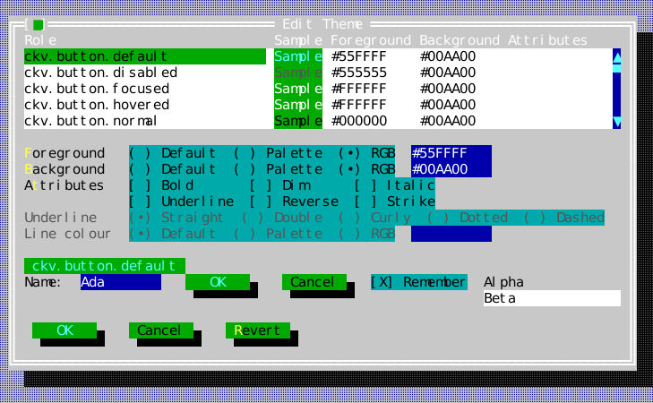
present_modal_theme_editor is the standard dialog that lets a reader restyle an
application. It enumerates the roles of the theme's flat role table — every
role the registry holds, the application's own and a third party's alike,
sorted by name so that each family (ckv.window.*, ckv.button.*) reads as
one group — and shows the style each one resolves to: a sample drawn in it,
its foreground and background in the saved-theme colour spelling below, and
its attributes by name. A column title sorts the table by that column.
Below the table are typed editors for the role under the cursor. Each colour
is one of the three kinds a Color can be — the terminal's default, a
palette entry, or RGB — with a field for its value (an index 0–255, or
#RRGGBB). A field admits only what its kind can spell, and while it does not
hold a valid value it shows as invalid and changes nothing. Choosing another
kind converts the colour: a palette entry to the RGB value it names, an RGB
colour to the nearest palette entry, and the default to the colour it stands
for — entry 7 for a foreground or 0 for a background, the entries a terminal
conventionally shows for them. A check box per attribute edits Attr.
The underline has two editors of its own below the check boxes. Underline
chooses the UnderlineShape the rule is drawn with — straight, double,
curly, dotted or dashed — and Line colour is a third colour editor of the
same kind-and-value form, with the same validation, for underline_color.
Its default means the rule follows the text, so choosing a palette entry or
RGB for a default underline colour starts from the text's own colour. Both
editors are enabled only while Underline is checked: a shape or colour means
something only on an underlined style, and clearing Underline drops them, as
the Style contract asks. A terminal that does not claim underline_styles
draws every shape as the plain rule
(What a colour is, and what an underline looks like),
but the edited theme keeps what the reader chose, and its saved text keeps it
too (underline <shape> and ulcolor <color>, in
Saving and loading a theme).
Revert puts the role back the way the editor found it, underline included.
Every change shows at once in a live preview: the role's own name drawn in its style, beside a label, a field, a default and a plain button, a check box and a list, all drawn with the edited theme through a subtree theme override. The application's theme is untouched until the reader accepts.
The dialog is non-blocking like the other standard dialogs: it completes with a
ThemeEditorResult after its window has detached, and theme holds the edited
theme only when the reader pressed OK. The editor applies and saves nothing.
The Workbench example's View → Edit theme… shows the whole round trip:
install the accepted theme with Application::set_theme, which repaints every
surface, and save its text through the injected FileSystem; at start, read
the saved text back over the classic scheme, and tell the reader when the file
is there but is not a theme.
// The theme editor edits a copy of the application's theme. Accepting it
// installs the edited theme -- set_theme repaints every surface -- and saves
// its text; cancelling leaves everything as it was.
void WorkbenchApp::edit_theme() {
    dialogs_.await(widgets::present_modal_theme_editor(app_.theme(), app_, *desktop_, roles_),
                   [this](widgets::ThemeEditorResult result) {
                       if (!result.theme) return;
                       app_.set_theme(*result.theme);
                       save_theme(*result.theme);
                   });
}

void WorkbenchApp::save_theme(const ui::Theme& theme) {
    if (theme_file_.files == nullptr) return;
    FileSystem& files = *theme_file_.files;
    files.create_directories(files.parent(theme_file_.path));
    const FileWriteResult written = files.write_file_atomic(theme_file_.path, ui::serialize_theme(theme));
    if (written.status != FileWriteStatus::Ok)
        report_theme_file("The theme could not be saved to " + theme_file_.path + ".");
}

void WorkbenchApp::load_theme() {
    if (theme_file_.files == nullptr) return;
    const std::optional<FileReadResult> saved = theme_file_.files->read_file(theme_file_.path);
    if (!saved) return;
    ui::ThemeParseResult parsed = ui::parse_theme(saved->contents, app_.theme());
    if (!parsed) {
        report_theme_file("The saved theme in " + theme_file_.path + " could not be read (line " +
                          std::to_string(parsed.error.line) + ": " + parsed.error.message +
                          "). The classic theme is used instead.");
        return;
    }
    app_.theme() = std::move(*parsed.theme);
}
test_theme_editor.cpp drives the dialog through the application:
changing_a_roles_foreground_by_keyboard_shows_it_live_and_ok_returns_the_edited_theme,
the_theme_editor_is_operable_by_mouse_alone,
a_value_the_colour_kind_cannot_hold_changes_nothing_until_it_is_valid,
choosing_a_colour_kind_converts_the_colour_the_role_had,
clearing_underline_drops_its_shape_and_colour_and_revert_restores_the_role,
the_underline_editors_are_enabled_only_while_underline_is_checked,
changing_the_underline_shape_and_colour_by_keyboard_shows_it_live_and_round_trips_as_text,
changing_the_underline_shape_and_colour_by_mouse_returns_them_in_the_theme,
a_default_underline_colour_converts_from_the_texts_colour,
revert_restores_the_underline_shape_and_colour.
test_workbench_smoke.cpp:
workbench_edit_theme_changes_one_role_repaints_the_desktop_and_saves_the_theme
opens the editor from the menu, changes one role, accepts, and checks the
terminal's own frame. The appearance matrix pins the dialog under all four
schemes (tests/golden/appearance/ThemeEditor/), its underlined state with
the underline's editors enabled and in use.
Saving and loading a theme
ui/theme_format.hpp gives a theme a deterministic text form.
serialize_theme(theme) writes it; parse_theme(text, base) reads it back.
The text is version 1 of this grammar, one line each, every line ending in a
line feed:
ckvision-theme 1
shadow halve | shadow recolor fg <color> bg <color>
<role> fg <color> bg <color> attrs <attrs>[ underline <shape>][ ulcolor <color>]
- The second line states the theme's shadow:
shadow halve, orshadow recolor fg <color> bg <color>(the Classic scheme writesshadow recolor fg #555555 bg #000000). It is read only in that place, so a role that happens to be namedshadowstill reads as a role there. A text without it keepsbase's shadow, as it keeps the look of the roles it does not name. - There is one role line for every role of the theme's registry, in byte order of the role names, never in the order the roles happened to be interned. Each states the style the role resolves to, an override and a registry fallback alike, so a saved theme is the whole truth: no line depends on another, and none on the scheme that was the base.
<color>is spelled as in a golden dump:default,@<index>(canonical decimal, 0–255) or#RRGGBB(written in uppercase, read in either case).<attrs>is-or a comma-separated set ofbold,dim,italic,underline,reverseandstrike, written in that order and read in any order, each at most once.underline <shape>(double,curly,dottedordashed) andulcolor <color>(notdefault) appear only on an underlined style, in that order. The plain rule and a rule that follows the text are spelled by their absence.- A role name is 1–128 bytes of printable ASCII other than the space.
serialize_themeasserts it of every registry name.
parse_theme returns a copy of base with every role the text names set to
the style it gives; a role the text does not mention — one added after the
theme was saved — keeps base's look. A well-formed line naming a role the
registry does not hold is skipped and listed in unknown_roles, so a theme
saved by a build with more widgets still loads. Everything else a file can get
wrong is refused, with the line it is on, before any of it takes effect: a text
over 1 MiB (kMaxThemeTextBytes), one whose last line is not terminated, a
wrong header, a control character or a byte outside printable ASCII anywhere,
fields not separated by exactly one space, an over-long role name, a role
named twice, a malformed shadow line, an unknown keyword, colour, attribute or
shape, a duplicated attribute, and an underline refinement on a style that is
not underlined.
test_theme_format.cpp:
every_built_in_scheme_round_trips_through_its_text_byte_for_byte_and_role_for_role,
serializing_does_not_depend_on_the_order_roles_were_interned_in,
parse_refuses_a_malformed_role_line_and_names_it,
every_single_byte_corruption_of_a_theme_text_is_refused_or_reads_back_canonically,
the_shadow_line_names_a_halving_or_a_recolouring_shadow_right_after_the_header,
parse_refuses_a_malformed_shadow_line_and_reads_one_only_after_the_header.
The fuzz_theme_format target holds every accepted text to the same canonical
round trip.
Scene composition
Every visible change goes through one drawing API, scene::Painter, onto a
scene::Surface: a grid of cells with per-row damage and the raster regions
painted onto it. scene::Compositor then assembles a background surface and
z-ordered layers (retained window and popup surfaces) into one frame, and the
Presenter turns that frame and its visible pictures into terminal bytes. An
application never drives these directly; Application::step() does. The
rules below are what a widget author can rely on, and each names the goldens
that pin it.
Clip rects and translation
A Painter takes coordinates in its own local space, with (0,0) at its
view's top-left, while clip() is the absolute rectangle it may touch.
translated(offset, local_clip) gives a child a new origin and a clip that
is intersected with the parent's, so a child can never paint outside what its
parent allows, whatever it asks for. clipped(sub_clip) narrows the clip and
keeps the origin; draw_image uses it to keep a fallback inside its anchor.
The view tree hands every child such a translated, clipped painter.
Clipping never cuts a character:
fillcovers the part of its rectangle inside the clip.draw_textdraws each grapheme cluster whole or not at all. A cluster that would cross the right edge ends the run. One that starts left of the left edge is not drawn; the part of it inside the clip becomes blank cells in the cluster's style, so a view scrolled sideways shows a selection or a link running on to the edge rather than a hole, and the clusters after it still land in their own columns.- Lines and box edges are clipped cell by cell, and corners outside the clip are not drawn. A junction on the clip edge keeps the directions of the parts the clip hides, so a line that runs on past the edge still reads as running on.
painter_clipping.dump
(golden_translated_clipped_painter_cuts_every_primitive_at_the_clip_edges)
pins all of this for one translated painter whose clip takes two edges from
its own request and two from its parent. The widget width sweeps pin the same
guarantee one level up: ten text-drawing widget families, each clipped at
every width from 0 until its text fits, with no cell holding part of a
cluster (tests/test_clip_sweep_golden.cpp, one
tests/golden/clip_sweep_<family>.dump per family, for example
clip_sweep_label.dump).
Junction scopes (D-036)
Box-drawing lines merge into tees and crosses only with lines from the same
logical paint. A Surface keeps the connector directions and a paint-scope
id beside every line cell. translated() and clipped() keep their parent's
scope; isolated() starts a new one, and the view tree gives every view its
own. A divider a view draws across its own frame therefore joins that frame,
while a foreground window's border drawn over a background window's border
replaces it rather than forming a cross. An ordinary cell write clears the
provenance; a style-only pass such as a shadow keeps it.
box_and_junctions.dump pins same-scope tees, and window_z_order_junction.dump pins two overlapping windows whose frames stay independent.
Shadows: one binary union (D-037)
A layer that casts a shadow covers an L-shaped footprint of two
non-overlapping rectangles (shadow_footprint): a strip ShadowSpec::dx
columns wide down the right side, starting dy rows below the top, and a
strip dy rows tall along the bottom. Coverage is binary. A covered cell
gets the shadow transform exactly once, however many footprint pieces or
windows cover it, so overlapping shadows never make a darker intersection.
Coverage follows z-order: a lower window's shadow cannot dim a higher window
painted after it.
What the transform is belongs to the theme (D-106). Theme::shadow() holds a
ShadowStyle (core/shadow_style.hpp), which is one of two transforms:
ShadowStyle::halve()halves every RGB channel of a covered cell's foreground and background, rounding down, so the covered colours show through darker. A palette index is resolved to its default RGB first, and the terminal's default colour is taken as black. A newThemehalves, and so do the Dark, Light, Mono and high-contrast schemes.ShadowStyle::recolor(fg, bg)draws a covered cell infgonbg. The Classic scheme recolours to dark grey#555555on black, the classic black shadow of the text-mode desktops it is modelled on.
Either way the cell keeps its glyph, its attributes and its underline shape; an underline colour of its own is darkened with the cell, one that follows the text keeps following it. The Application composes every frame with its own theme's shadow (never a subtree override's: a shadow is a composition effect), and a theme switch that changes it re-resolves every shadowed cell. A Desktop painted without the Application's compositor casts its shadows with the theme it resolves.
A picture under a shadow is cut into its own slices, and each covered
RasterSlice carries the style in RasterSlice::shadow; the Presenter passes
every pixel of it through the same transform. Halving halves the channels.
Recolouring maps the pixel's luminance (integer BT.601 weights, 299:587:114)
linearly into the range from black to the shadow's foreground, so a picture
under a Classic shadow keeps its shapes and shading in dark grey, as its
neighbouring glyphs do. All of it is integer arithmetic: a shadow darkens
identically on every platform.
shadow.dump pins the footprint,
shadow_binary_union.dump two
overlapping shadows that dim their intersection once (both halving), and
contained_shadow_union.rgba
the same union over decoded Sixel pixels under the Classic shadow.
test_color_style_cell.cpp pins both transforms on cells and pixels
(a_recolouring_shadow_maps_pixel_luminance_from_black_to_its_foreground),
and test_compositor.cpp a recolouring shadow and a change of shadow
(a_changed_shadow_style_restyles_every_shadowed_cell_without_other_damage).
appearance/Window/normal.classic.dump
shows the Classic shadow beside a window.
Raster regions and occlusion slicing
Painter::draw_image first runs the picture's mandatory fallback (D-017),
then records a RasterRegion: the full anchor, and the part of it inside the
painter's clip. The composed frame's surface holds cells only. The
compositor reports the pictures separately as visible_rasters(): each
region is cut by the content of every higher layer into rectangular
RasterSlices, and cut again where a higher layer's shadow begins. A picture
half covered by a window arrives as several slices, each carrying the full
anchor, so the Presenter can crop the right pixels. Whether pixels or the
fallback reach the screen is the Presenter's decision for the terminal's
capabilities (D-080), never the scene's.
scene::capture(surface) records a surface's own, unsliced regions;
scene::capture_frame(compositor) records one raster line per visible
slice. For a running application, capture
scene::capture_frame(app.compositor(), app.current_cursor()).
raster_occlusion.dump pins one
region cut into four slices. The appearance matrix pins a symbolic scene for
every state of the raster widgets, for example
ImageView/sixel.classic.scene,
and its gate requires each sixel scene to equal its no-graphics scene.
presenter_occlusion.dump and its
.rgba show the decoded result on the terminal.
Row damage
Each surface row carries a damaged column span, DamageSpan [lo, hi).
Surface::set_cell and every Painter write damage what they touch, even
when the content is unchanged. Compositor::compose reads the damage of the
background and of every layer, clears it, and resolves only damaged cells
plus whatever a moved, added or removed layer uncovered; it remembers each
layer's id, rectangle and shadow between calls to find those. The work is
counted, not timed: last_compose_cells_touched() is zero for an unchanged
frame and one for a single changed cell.
Damage decides cost, not appearance, so counts pin it rather than pictures:
steady_state_recompose_touches_zero_cells and
content_change_in_a_layer_only_damages_that_cell in
tests/test_compositor.cpp, and the scene_budget_gate benchmark
(Performance). The frames that damage-driven composition
produces are pinned like any other, for example
contained_move.dump after a window
move.
What a colour is, and what an underline looks like
A Color is one of three things, and the difference is kept rather than
collapsed: the terminal's own foreground or background, an entry in the
palette named by its index, or a specific 24-bit colour. Themes name concrete
colours; an embedded terminal's child usually names palette entries. Keeping
the index is what lets a palette be re-themed later — "the palette's red" is a
different fact from "this particular red" — and it is what lets the index
reach the outer terminal unchanged, so a reader's own theme applies to it.
core/palette.hpp is the one place that turns an index into channels, for the
things that genuinely need pixels: dimming a shadow, writing an SVG, or
quantising for a host with fewer colours. resolved_color(colour, fallback)
is the call; everything in between carries the index.
Style::underline refines an underline that is being drawn — straight,
double, curly, dotted or dashed — and Style::underline_color gives the rule a
colour of its own, defaulting to "follow the text". Both are meaningful only
while Attr::Underline is set, and clearing the underline restores them, so
two cells that look alike compare alike. A shape reaches the screen only where
the host declares underline_styles; without it every shape degrades to the
plain rule, which still reads as emphasis.
Progress meters resolve independent ckv.progress.track, fill, label and
disabled roles (D-119). The schemes initially give track/fill their classic
list/menu palette values, but changing list or menu roles does not restyle a
meter. Block and Segmented presentations use the fill background as glyph ink
on the track surface; the disabled foreground replaces that ink when inert.
Input accessories use ckv.input.accessory and ckv.input.accessory.hovered.
They distinguish the ComboBox dropdown arrow and SearchBox clear control while
keeping the field's color family. Field padding and underlines use existing
normal/focused/invalid/disabled input roles. Focus adds bold emphasis to the
underline; caret and selection retain their independent reverse attribute.
Optional row bands use ckv.list.banded and ckv.table.banded, independently
from normal and selected surfaces. ckv.table.divider accents thin column rules
while preserving the header/row background. Banding follows absolute display
indices; explicit row/cell styles, editing and selection take precedence.
Wizard alternate layouts use independent ckv.wizard.header,
ckv.wizard.footer and ckv.wizard.rail surface roles. They start from each
scheme's dialog foreground and alternate surface background; overriding list
roles afterward does not restyle them. Compact retains the dialog surface.