Widget gallery
Every entry below names the public header, tells you where to place the type,
and points to a real example/capture. The code blocks are extracted from the
compiled example applications; run tools/docgen/extract_snippets.py --write
after changing their source rather than maintaining copy-pasted documentation.
The Forms frame is the compact reference for editable controls; the Workbench tabs cover text/data/utility components.
| Forms | Workbench: text | Workbench: data | Workbench: utilities |
|---|---|---|---|
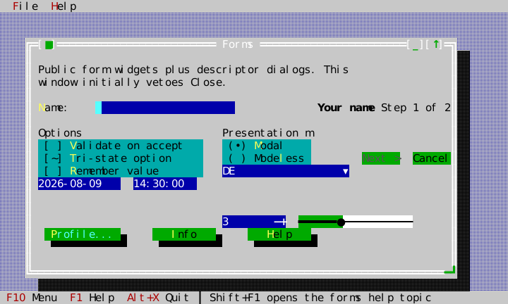 | 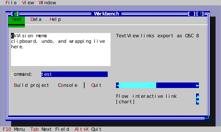 | 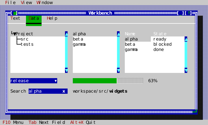 | 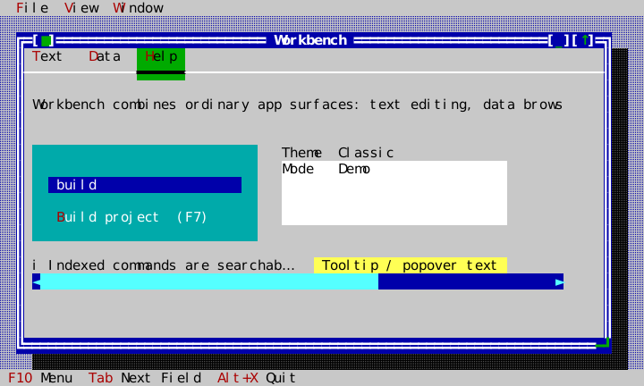 |
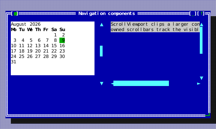
The navigation components have their own public-API capture because a calendar and a scrolling viewport do not belong naturally in the compact Forms or Workbench windows.
DocumentPosition
Header: include/cvision/widgets/editor_document.hpp. A revision-bound,
grapheme-boundary byte position in an EditorDocument; obtain it from the
document instead of retaining an unversioned offset.
DocumentRange
Header: include/cvision/widgets/editor_document.hpp. A half-open pair of
positions from one document revision. It is the unit accepted by replacement,
selection, and search results.
DocumentLineColumn
Header: include/cvision/widgets/editor_document.hpp. A logical line and
grapheme column, not a terminal-cell coordinate.
EditorDocumentOptions
Header: include/cvision/widgets/editor_document.hpp. Sets invalid-UTF-8 and
bounded undo-history policy when constructing a document.
DocumentSelection
Header: include/cvision/widgets/editor_document.hpp. An anchor and a caret as
byte offsets of one revision's text: the selection a transaction records for
its undo step and an undo or redo hands back; see
Editor.
DocumentChange
Header: include/cvision/widgets/editor_document.hpp. The deterministic
revision/change record delivered to document observers and returned by undo
and redo, with the selection those restore.
DocumentEditResult
Header: include/cvision/widgets/editor_document.hpp. The status and optional
change record returned by a document edit or transaction commit.
DocumentTextEdit
Header: include/cvision/widgets/editor_document.hpp. A requested replacement
used to assemble a revision-atomic DocumentTransaction.
DocumentTransaction
Header: include/cvision/widgets/editor_document.hpp. Collects non-overlapping
edits against one base revision; use it for replace-all and compound commands.
EditorDocument
Header: include/cvision/widgets/editor_document.hpp. The shared persistent
UTF-8 document model for TextEditor; see Editor.
SyntaxSpan
Header: include/cvision/widgets/syntax_profile.hpp. A semantic byte range in
one logical line emitted by a profile highlighter.
SyntaxLineResult
Header: include/cvision/widgets/syntax_profile.hpp. Syntax spans plus the
next immutable lexer state for incremental line processing.
LanguageDetectionInput
Header: include/cvision/widgets/syntax_profile.hpp. Explicit requested
profile, filename, prefix, and shebang data used for deterministic detection.
LanguageDetection
Header: include/cvision/widgets/syntax_profile.hpp. A profile detector's
score and diagnostic reason.
LanguageProfile
Header: include/cvision/widgets/syntax_profile.hpp. A stable language ID,
detector, and line highlighter registered by an application.
SyntaxProfileRegistry
Header: include/cvision/widgets/syntax_profile.hpp. Instance-owned language
profile registry; the editor guide registers JSON, YAML, Bash, Markdown, and
plain text.
SyntaxCacheLine
Header: include/cvision/widgets/syntax_cache.hpp. One cached source line:
the source text, validated semantic spans, and its incoming/outgoing lexer
state.
SyntaxRelexReport
Header: include/cvision/widgets/syntax_cache.hpp. Deterministic evidence of
where an incremental lexical update began, how many lines it processed, and
whether it reached a state fixed point.
SyntaxCache
Header: include/cvision/widgets/syntax_cache.hpp. A reusable incremental
line-state cache for a LanguageProfile; TextEditor uses it to avoid
rehighlighting an unchanged lexical suffix.
EditorSearchQuery
Header: include/cvision/widgets/editor_search.hpp. The literal search text
and case/whole-word options for EditorSearch.
EditorSearchMatch
Header: include/cvision/widgets/editor_search.hpp. A revision-bound match
range returned by deterministic literal search.
EditorSearch
Header: include/cvision/widgets/editor_search.hpp. Finds literal matches and
performs one-transaction replace-all; see Editor.
EditorStatus
Header: include/cvision/widgets/text_editor.hpp. Line/column, selection,
modified, overwrite, virtual-caret, and profile data a client can place in its
own status UI.
EditorKeyBinding
Header: include/cvision/widgets/text_editor.hpp. One chord and the
EditorCommand it runs. TextEditor::set_key_bindings() replaces the list, so
an application with its own command table and keyboard scheme decides which
chords the editor answers itself; see Editor.
VirtualCaret
Header: include/cvision/widgets/text_editor.hpp. A provisional caret past the
text — a logical line, which may lie below the last one, and a cell column. It
writes nothing until text arrives; see Editor.
EditRequest
Header: include/cvision/widgets/text_editor.hpp. One text change the reader
asked for — its EditKind, text, and the replacement the editor would commit —
handed to an edit handler before anything changes; see
Editor.
HighlightSpan
Header: include/cvision/widgets/text_editor.hpp. A host-computed byte range
of the document and the theme role it is painted in; see
Editor.
EditorStatusModel
Header: include/cvision/widgets/text_editor.hpp. Scoped, instance-owned
observer model that mirrors one editor's status for independently composed
window chrome or status UI.
TextEditor
Version numbers and release titles inside the specimen documents on this page are fictional client data. They do not identify a ckVision release; the library version is declared by the root CMake project and shown in the repository's release list.
Header: include/cvision/widgets/text_editor.hpp. The dedicated shared-
document editing view with keyboard/mouse selection, scrolling, gutter, syntax
roles, and clipboard commands. It is not a Memo replacement; see Editor.
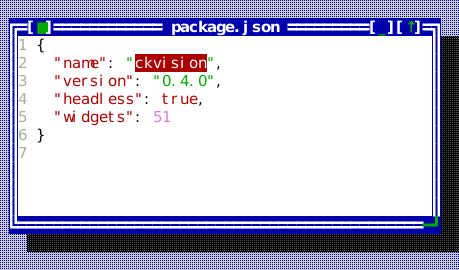
The compiled scene below is the source of this figure.
widgets::SyntaxProfileRegistry profiles;
widgets::register_standard_syntax_profiles(profiles);

auto document = std::make_shared<widgets::EditorDocument>(
    "{\n"
    "  \"name\": \"ckvision\",\n"
    "  \"version\": \"0.4.0\",\n"
    "  \"headless\": true,\n"
    "  \"widgets\": 51\n"
    "}\n");

auto editor = std::make_unique<widgets::TextEditor>(document, &profiles);
editor->set_file_name("package.json");   // the profile detector reads this
editor->set_show_line_numbers(true);
editor->set_wrap_mode(widgets::WrapMode::None);
editor->set_vertical_scrollbar_policy(widgets::ScrollbarPolicy::Auto);
editor->set_search_query(widgets::EditorSearchQuery{"ckvision", false, false});
FileEditorController
Header: include/cvision/widgets/file_editor_controller.hpp. Explicit safe
load/save/save-as controller over an injected FileSystem, including external-
change conflict detection and newline preservation.
EditorOpenOptions
Header: include/cvision/widgets/file_editor_controller.hpp. Per-open input
policy for FileEditorController. File input rejects malformed UTF-8 unless a
client deliberately passes InvalidUtf8Policy::Replace; the choice is local
to that open and does not silently alter the document's normal edit policy.
The same options require an explicit discard choice before replacing dirty
content with another file.
EditorWindow
Header: include/cvision/widgets/editor_window.hpp. Optional reusable window
composition owning a TextEditor, FileEditorController, dirty title, status
overlay, and safe implicit close veto. Clients may instead compose the lower-
level editor and controller themselves.
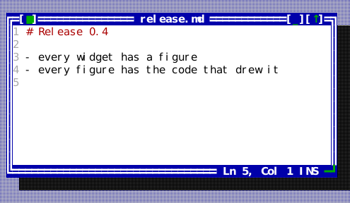
The compiled scene below is the source of this figure.
static widgets::SyntaxProfileRegistry profiles;
widgets::register_standard_syntax_profiles(profiles);

auto window = std::make_unique<widgets::EditorWindow>(
    "release.md", std::make_shared<widgets::EditorDocument>(), files, &profiles);
window->set_bounds(Rect{14, 4, 52, 13});
window->open("/notes/release.md");
window->editor().set_show_line_numbers(true);
widgets::EditorWindow* editor_window = stage.desktop().add<widgets::EditorWindow>(
    std::move(window));
ApplicationShell
Header: include/cvision/widgets/application_shell.hpp. Use when a small app
needs a Desktop, classic theme, menu bar, tool bar and status line in one
construction step. The Application owns that Desktop while the shell helper is alive; the
helper can call detach_desktop() when its controller must end before the
Application. Hello is the complete source; use explicit
Desktop construction when the shell needs more customization.
ApplicationShellOptions
Header: include/cvision/widgets/application_shell.hpp. This aggregate
configures the shell's theme, menu definitions, status items, and tool bar
items with the edge the tool bar docks to (tool_bar_edge: under the menu
bar, or above the status line). Keep command
behavior in the Application registry and use the options only to present it.
Button
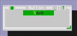
Header: include/cvision/widgets/button.hpp. set_flat(true) drops the cast
shadow and the classic ten-cell footprint: one row, as wide as its label, with
the press shown in ckv.button.pressed since there is no geometry left to
show it in. For a control inside a dense row — a stepper beside a field — that
should still arm, disarm when the pointer slides off it, and fire on release
like any other button. Put buttons in a window or
dialog content view; Space/Enter activate the focused/default button and a
mouse click invokes on_press. Use it for an immediate action, not a command
shortcut duplicated elsewhere. Forms shows default and ordinary buttons. The
classic metric is a ten-cell minimum footprint; use set_minimum_width() only
to make a related button family deliberately wider.
set_hold_repeat(Button::HoldRepeat{...}) makes a stepper or scroll-arrow
button repeat while the primary mouse button holds it down: it fires on the
press, again after the initial delay (400 ms by default), then once per
interval (100 ms by default), timed on the Application's injected clock
through its timers. Repeating stops on release, when the pointer leaves the
button, and when the button is disabled; a pointer that returns while the
button is still held starts it again from the initial delay. The keyboard is
unchanged.
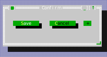
The compiled scene below is the source of this figure.
auto* save = content.make<widgets::Button>("&Save");
save->set_bounds(Rect{2, 2, 12, 2});
save->set_default(true);
save->on_press = [] { /* run the save command */ };

auto* cancel = content.make<widgets::Button>("&Cancel");
cancel->set_bounds(Rect{16, 2, 12, 2});
cancel->on_press = [] { /* dismiss */ };

auto* step = content.make<widgets::Button>("+");
step->set_flat(true);  // one row, no shadow, as wide as its label
step->set_bounds(Rect{30, 2, 3, 1});
// Held down, it steps again after 400 ms and then every 100 ms.
step->set_hold_repeat(widgets::Button::HoldRepeat{});
step->on_press = [] { /* one step */ };
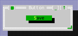
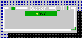
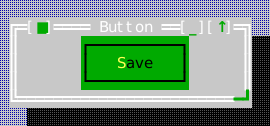
Button offers explicit ButtonPresentation::Classic, Flat, Padded and
Outlined styles. Padded uses a one-row colored face with one inset cell per
side; Outlined uses a three-row enclosure. Both distinguish bold default-action
emphasis from underlined keyboard focus. Caption, presentation and bounds changes
cancel armed presses; all styles share activation and hold-repeat behavior.
Button's cancel_press() cancels an outstanding pointer, keyboard or repeat
activation. Owners use it when an action's meaning changes while its rectangle
stays stable, such as replacing a wizard's pages. A release received after the
button or its ancestor is disabled cannot activate it.
Display variants
All examples below use the same Classic color scheme. These are layout and containment choices configured per widget, rather than color variants.
Classic
Flat
Padded
Outlined
Canvas
Header: include/cvision/widgets/canvas.hpp. Use for deterministic client
drawn raster content. Set bounds/cell metrics, install a draw callback, and
use on_click for pointer interaction; image_pixel_at() maps an event's
reported pixel onto the backing image. Like ImageView it leaves the wheel to
an enclosing view that scrolls. See Graphics.
| Canvas with Sixel graphics | Canvas fallback without terminal graphics |
|---|---|
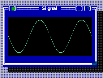 | 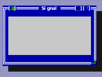 |
The compiled scene below is the source of this figure.
auto* canvas = content.make<widgets::Canvas>();
canvas->set_bounds(Rect{1, 1, 30, 7});
canvas->set_cell_metrics(stage.app().terminal_cell_pixels());
canvas->set_pixel_size(term::cells_to_pixels(Size{30, 7}, stage.app().terminal_cell_pixels()));
canvas->set_draw_callback([](Image& image) {
    for (int x = 0; x < image.width(); ++x) {
        const double phase = 6.283 * x / image.width();
        const int y = static_cast<int>((0.5 + 0.42 * std::sin(phase * 2)) * image.height());
        for (int thickness = 0; thickness < 2; ++thickness)
            image.set_pixel(x, std::min(image.height() - 1, y + thickness),
                            Image::Rgba{80, 220, 160, 255});
    }
});
canvas->set_fallback_painter([](scene::Painter& painter, Rect area) {
    painter.draw_text(Point{0, area.height / 2}, "[no graphics: 2 Hz sine]", Style{});
});
ComboBox
Header: include/cvision/widgets/combo_box.hpp. Use PickOnly for a closed
choice set and Editable when the user can type a value. Opening it drops a
PopupList: a real popup on the desktop, casting the standard
popup shadow, over the surface rather than inside the control, so the control keeps its requested height and its neighbours
are undisturbed while the list is up. Arrow keys navigate the list, Enter
takes a row, Escape and a press outside close it with nothing taken. Where
there is no desktop to drop a popup onto, the arrows step through the items in
place, so the control still works. When the dropdown is closed, Editable
uses the standard text keymap (word/boundary navigation, Shift selection,
Ctrl+C/X/V, Ctrl+Insert/Shift+Insert, and word deletion). Forms and Workbench
show both modes. An editable combo owns a real InputLine child, exposed as
field() for validation and editing configuration. Its geometry belongs to the
combo. Focus an instance through Application::set_focus(&combo.focus_target());
keyboard traversal reaches the editor in Editable mode and the combo in PickOnly.
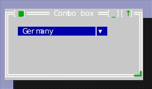
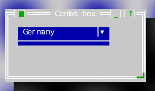
Padded and Underlined modes separate the dropdown arrow from the value with a
single divider. The arrow has independent accessory/hover roles, and the divider
has no action. Style changes dismiss an open popup and preserve the edited value.
set_history_key(key) names a list in the application's
history registry (Application::history()); an Editable combo then recalls
its entries with Up and Down while the list is closed, and Enter records the
text. Every input line, combo box, search box and dialog field naming the same
key shares that one list — see InputLine.
| Closed ComboBox controls | ComboBox with its PopupList open |
|---|---|
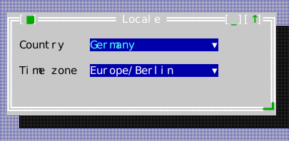 | 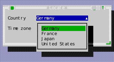 |
The compiled scene below is the source of this figure.
auto* country = content.make<widgets::ComboBox>(widgets::ComboBoxMode::PickOnly);
country->set_bounds(Rect{12, 1, 20, 1});
country->set_items({"Germany", "France", "Japan", "United States"});
country->set_selected_index(0);

auto* zone = content.make<widgets::ComboBox>(widgets::ComboBoxMode::Editable);
zone->set_bounds(Rect{12, 3, 20, 1});
zone->set_items({"Europe/Berlin", "Europe/Paris", "Asia/Tokyo"});
zone->set_text("Europe/Berlin");
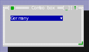
Display variants
All examples below use the same Classic color scheme. These are layout and containment choices configured per widget, rather than color variants.
Flat
Padded
Underlined
CommandPresentation
Header: include/cvision/widgets/command_presentation.hpp. This value maps a
registered command to a menu/status/toolbar surface. It inherits title, chord,
and enablement from the registry; dialogs and commands
shows the real Hello source.
CalendarView
Header: include/cvision/widgets/common_components.hpp. Use for a visible
month calendar where the user moves a date selection with arrows/page keys.
Place it in a dialog or application content view; pair it with DatePicker for
a compact field. It appears in the navigation capture above. The month it
shows is held between kFirstCalendarYear and kLastCalendarYear: the leap
rule and weekday it computes with are Gregorian, and that calendar began in
October 1582 — a month it also cannot draw, since ten days were struck out of
it — so 1583 is the first year it can state truthfully.
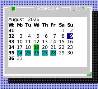
The compiled scene below is the source of this figure.
auto* calendar = content.make<widgets::CalendarView>();
calendar->set_bounds(Rect{1, 1, 28, 9});
calendar->set_month(widgets::DateValue{2026, 8, 1});
calendar->set_selected(widgets::DateValue{2026, 8, 19});
calendar->set_today(widgets::DateValue{2026, 8, 9});
calendar->set_marked_span(widgets::DateValue{2026, 8, 24}, widgets::DateValue{2026, 8, 28});
calendar->set_first_weekday(widgets::Weekday::Monday);
calendar->set_show_iso_week_numbers(true);
calendar->on_select = [](widgets::DateValue day) { (void)day; };
ClockView
Header: include/cvision/widgets/common_components.hpp. A clock for a menu
bar or status line. It ticks once a second, re-renders, and asks for a repaint
only when the rendered text differs — so a clock without seconds costs one
string comparison a second and one repaint a minute.
The time comes from an injected provider rather than from ckVision, whose
Clock is monotonic with an implementation-defined epoch and deliberately not
a wall clock; the provider is also what makes a clock testable. Seconds,
a blinking separator, and twelve- or twenty-four-hour display are options, and
the meridiem words are the host's to supply, as ckVision carries no locale
data. on_click lets a clock open something — see CalendarDropdown — and
set_open() draws it with the menu bar's own active role while that thing is
showing, so it reads as a menu title rather than as a second kind of control.
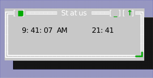
The compiled scene below is the source of this figure.
auto* clock = content.make<widgets::ClockView>();
clock->set_bounds(Rect{2, 1, 14, 1});
clock->set_time_provider([] { return widgets::TimeValue{9, 41, 7}; });
clock->set_show_seconds(true);
clock->set_hour_format(widgets::HourFormat::TwelveHour);
clock->set_meridiem_labels("AM", "PM");
clock->on_click = [] { /* drop a calendar under it */ };
BigClockView
Header: include/cvision/widgets/big_clock.hpp. A clock face that fills
whatever it is given: the time, the date, or both (BigClockContent), in
block glyphs five rows tall, centred. The glyphs are the seven-segment
display's shapes — except the 1, a centred stem with a flag and a foot, since
the segment 1 leaves a gap in front of it that reads as a space — drawn in
cells of the theme's lit colour, the progress bar's fill role, on the text-view
body. Where they do not fit, because the view is
narrower or shorter than the glyphs need, the same lines are drawn centred as
plain text, so a small window still tells the time; the view re-decides on
every draw, so a face follows its window as it is resized in either direction.
The reading comes from an injected DateTimeValue provider, as ClockView's
does, and for the same reason. Seconds, twelve- or twenty-four-hour display and
the meridiem words — drawn as a plain caption under the digits, since they are
words — are options. Like ClockView it ticks once a second and repaints only
when what it shows has changed. A face is put up to stay while the reader works
elsewhere, so losing the focus dismisses nothing; a key while it has the
keyboard, or a completed click on a face that already had it, fires
on_dismiss — the click that only brings it back into focus does not, and
neither does a key the application has bound to a command, which the face
leaves unhandled so the command runs with the face still up. The face
does not remove itself, because whoever put it up knows what it covers. big_glyph_rows() and big_glyph_width() expose the glyphs
themselves, as '#'/' ' masks, for a host that wants to draw them somewhere
else.
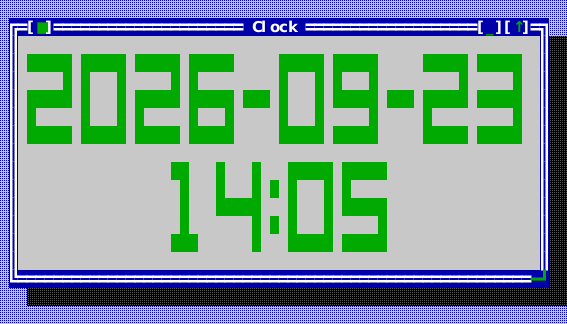
The compiled scene below is the source of this figure.
face->set_content(widgets::BigClockContent::DateAndTime);
face->set_show_seconds(false);
face->set_moment_provider([] {
    return widgets::DateTimeValue{widgets::DateValue{2026, 9, 23}, widgets::TimeValue{14, 5, 0}};
});
face->on_dismiss = [] { /* take the face down again */ };
CalendarDropdown
Header: include/cvision/widgets/common_components.hpp. A month, framed and
coloured as a dropdown menu, with the controls for choosing which month on one
row above it: a ComboBox of month names — as wide as its longest month and no
wider — then <<, a year field, and >>. Typing in the year field admits
digits and nothing else; Enter — or moving on with Tab — commits it, and a
year this calendar cannot draw gives the row over to the word invalid for
three seconds, the field stepping aside rather than holding what was rejected.
That range is kFirstCalendarYear (1583) to kLastCalendarYear: the
arithmetic here is Gregorian, so 26 is refused rather than drawn as a grid
for a year that had a different calendar.
show_month() sets all three at once, so the picker and the field never
disagree with the grid. set_labels() takes every word it shows — the month
names, the weekday headings and the word over a refused year — from one
DateTimeLabels table. Opening the month list grows the popup to the list's
own length where there is room below, so twelve months are not read through
eight rows.
It is a transient popup: it closes on Escape and on a press anywhere but
itself. That behaviour is what separates a dropdown from a small window, and
it is deliberately not in CalendarView — the same calendar sits permanently in
a dialog elsewhere and must not vanish when the reader clicks beside it. Open
one with show_calendar_dropdown(), which hangs it under an anchor with their
right edges aligned, the way a submenu hangs from the right end of a bar, and
pulls it back inside the desktop rather than letting it run off the edge. It
scopes input while it is up, so Tab walks its own three controls — days, month,
year — and reaches nothing behind it. request_dismiss() closes it as Escape
does, for the control that opened it when something else ends the
interaction; a DatePicker given a host with set_calendar_host() drops one on
Space or its ▾, and DatePicker::close_calendar() takes it away again without
choosing, as a PropertyInspector does when new rows end a date edit.
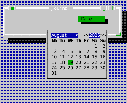
The compiled scene below is the source of this figure.
widgets::CalendarDropdown* month =
    widgets::show_calendar_dropdown(*anchor, stage.app(), stage.desktop());
month->show_month(widgets::DateValue{2026, 8, 1});
month->calendar().set_selected(widgets::DateValue{2026, 8, 19});
month->calendar().on_select = [](widgets::DateValue day) { (void)day; };
DateValue
Header: include/cvision/widgets/common_components.hpp. A plain deterministic
year/month/day value used by CalendarView and DatePicker; Forms initializes one
in the source-backed control setup below.
TimeValue
Header: include/cvision/widgets/common_components.hpp. A plain hour/minute/
second value used by TimePicker; it has no implicit system-clock behavior.
DateTimeValue
Header: include/cvision/widgets/common_components.hpp. A DateValue and a
TimeValue read together, as BigClockView's provider returns them: one reading
rather than two, so a face showing both cannot pair one day's date with the
next day's time when it is asked just after midnight.
DateTimeLabels
Header: include/cvision/widgets/common_components.hpp. Every word a date or
time control shows, in the host's language: the twelve month names, the seven
weekday headings (Monday first, at most two columns each), the meridiem words,
the empty date field's text, the reason given for a typed date that is refused,
and the word a calendar dropdown shows over a refused year. ckVision reads no
locale; a default-constructed table is the English one
(english_date_time_labels()). DatePicker::set_labels,
CalendarDropdown::set_labels, TimePicker::set_meridiem_labels,
FieldDescriptor::date_time_labels and the
date and time dialogs all take
their words from it.
widgets::DateTimeLabels labels;
labels.month_names = {"Januar", "Februar", "März", "April", "Mai", "Juni", "Juli",
                      "August", "September", "Oktober", "November", "Dezember"};
labels.weekday_names = {"Mo", "Di", "Mi", "Do", "Fr", "Sa", "So"};
labels.no_date = "— kein Datum —";
labels.not_a_date = "Kein Datum.";
date_picker->set_labels(labels);
DateFormat
Header: include/cvision/widgets/common_components.hpp. How a date is
written, shown and read: the formatting and parsing policy of a DatePicker and
of a descriptor form's Date field. The options name the order of the three
DateFields, the separator between them, whether the month is a number or a
name (MonthStyle, the names from a DateTimeLabels table), and whether a
numeric month and the day are written with two digits. format_date() writes a
date that way and parse_date() reads one back strictly: exactly three parts,
a four-digit year, a month and day of the width the options write (a name is
compared without regard to ASCII case), and a real day in a drawable year. The
default is the ISO form, identical to format_iso_date() and
parse_iso_date().
A caller whose dates the options cannot describe supplies format and parse
callbacks instead. A DatePicker shows the format text while it does not have
the focus and reads typed dates with parse; with the focus it shows the
options' layout, because that is where its segments are, and a caller's
arbitrary text has none it could find. A date a caller's parse returns that
is not a real day is still refused.
widgets::DateFormat dotted;  // 19.08.2026
dotted.order = {widgets::DateField::Day, widgets::DateField::Month, widgets::DateField::Year};
dotted.separator = ".";
widgets::DateFormat american;  // 8/19/2026
american.order = {widgets::DateField::Month, widgets::DateField::Day, widgets::DateField::Year};
american.separator = "/";
american.zero_pad = false;
const std::optional<widgets::DateValue> read = widgets::parse_date("19.08.2026", dotted);
DatePicker
Header: include/cvision/widgets/common_components.hpp. Use for a compact
optional date field. Left/Right walk the year, month and day segments in the
order its DateFormat writes them; Up/Down adjusts the active
one; Delete clears an optional value. Pointer clicks select a segment and the
wheel adjusts it. The caller supplies a deterministic seed (normally its
injected notion of today), so the control never reads a clock or locale.
format_iso_date() and parse_iso_date() provide the strict typed
YYYY-MM-DD boundary; add_calendar_days() performs bounded Gregorian date
arithmetic without reading a clock.
A date can also be typed. Any printable character other than a space opens an
entry, drawn in place of the value with the caret at its end; Backspace takes
back its last grapheme. Enter, or leaving the field, commits it through the
format's parser. A date it cannot read — 30.02.2026, tomorrow — is refused
as typed, never guessed at or clamped: the field is drawn in the
ckv.input.invalid role, validation_message() gives the reason from the
labels' not_a_date, and on_invalid fires with it. Escape abandons the
entry; an arrow, the wheel or a click commits it first.
Declarative forms can request the same control with FieldKind::Date,
initial_date, date_seed, date_optional, date_format and
date_time_labels. Accepted DialogResults carry the answer in the parallel
dates vector and canonical YYYY-MM-DD text in values, whatever the
format. A form that holds a refused typed date does not accept: the field
takes the focus and its reason stands in the form's description panel, as a
veto does. Set
DialogDescriptor::help_context_key to make every field and button inherit
the form's contextual F1 topic.
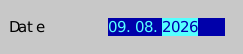
The compiled scene below is the source of this figure.
auto* date = content.make<widgets::DatePicker>();
date->set_bounds(Rect{12, 1, 13, 1});
widgets::DateFormat dotted;  // DD.MM.YYYY, written and read
dotted.order = {widgets::DateField::Day, widgets::DateField::Month, widgets::DateField::Year};
dotted.separator = ".";
date->set_format(std::move(dotted));
date->set_value(widgets::DateValue{2026, 8, 9});
date->on_change = [](std::optional<widgets::DateValue> value) { (void)value; };
TimePicker
Header: include/cvision/widgets/common_components.hpp. Use for a compact
time field. Arrow keys adjust the active component; the caller supplies and
reads a TimeValue. On the twelve-hour face the meridiem words are the
host's (set_meridiem_labels, "AM" and "PM" by default); an empty word leaves
the suffix off.
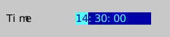
The compiled scene below is the source of this figure.
auto* time = content.make<widgets::TimePicker>();
time->set_bounds(Rect{12, 3, 12, 1});
time->set_value(widgets::TimeValue{14, 30, 0});
time->set_show_seconds(true);
time->set_24_hour(true);
time->on_change = [](widgets::TimeValue value) { (void)value; };
SpinBox
Header: include/cvision/widgets/common_components.hpp. Use for a small
bounded integer. Set the range before setting the value; the arrow keys, a
click on either half of the field and the mouse wheel change it in range.
An editable box (set_editable(true)) also takes a typed number. Typing opens
an entry drawn in place of the value with the caret at its end; Enter, or
leaving the box, commits it. An entry that is not a whole number, or is outside
the range, is refused and never clamped: the entry stays as typed, the box is
drawn in the ckv.input.invalid role, validation_message() gives the reason
and on_invalid fires with it — the same reason a host can stand in a dialog
as a DialogVeto. Editing
the entry clears the mark until the next commit; Escape abandons it. The
reasons are English by default ("Not a whole number.", "Enter a number from 1
to 16.") and come from set_refusal_text when the host gives its own. An
arrow, a click or the wheel commits an entry first and steps from what it
committed.
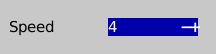
The compiled scene below is the source of this figure.
auto* speed = content.make<widgets::SpinBox>();
speed->set_bounds(Rect{12, 4, 10, 1});
speed->set_range(1, 16);  // set the range BEFORE the value
speed->set_step(1);
speed->set_value(4);
speed->set_editable(true);  // a number may be typed, and is checked on Enter
speed->on_change = [](int value) { (void)value; };
speed->on_invalid = [](const std::string& reason) { (void)reason; };
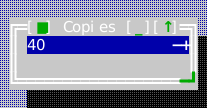
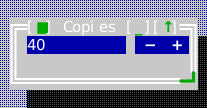
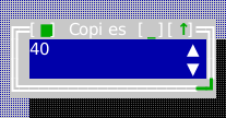
SpinBox offers SpinBoxPresentation::Compact, Separate and Stacked. Compact
places adjacent minus/plus controls after an unbracketed field. Separate uses
three-cell controls with a blank gap; Stacked places up/down controls beside a
two-row field. field_bounds(), decrement_bounds() and increment_bounds()
expose the shared local rectangles. Field clicks do not step the value. Keyboard
and wheel adjustment, entry validation and callbacks remain shared. Focus
underlines the value; accessory roles distinguish steppers, hover and unavailable
limits. Editable fields report a Text pointer; unavailable steppers report
NotAllowed. Long entries scroll by complete graphemes with a caret cell reserved.
Display variants
All examples below use the same Classic color scheme. These are layout and containment choices configured per widget, rather than color variants.
Compact
Separate
Stacked
SliderTick
Header: include/cvision/widgets/common_components.hpp. One labelled mark on
a Slider's scale: the value it stands at, in the slider's own units, and the
text under it.
Slider
Header: include/cvision/widgets/common_components.hpp. Use for a bounded
continuous-looking value where a visual position is useful. Arrows and pointer
input adjust the value; retain a textual value/label when precision matters.
With set_ticks the slider is two rows high: each tick marks its column on the
track, and its label stands on the row below, centred on the mark and moved
inward to stay inside the slider. Labels never overlap and keep a blank between
them. They are placed in the order the ticks are given, and one that would
collide with a label already placed is left out while its mark stays, so the
host lists first the labels that must show — the two ends, typically — and the
same slider shows the same labels on every run.
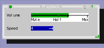
The compiled scene below is the source of this figure.
auto* volume = content.make<widgets::Slider>();
volume->set_bounds(Rect{12, 1, 26, 2});  // two rows: the track and its tick labels
volume->set_range(0, 100);
volume->set_step(5);
volume->set_value(65);
// The labels that must show come first; a later one that would collide
// with them is left out, its mark kept.
volume->set_ticks({{0, "Mute"}, {100, "Max"}, {50, "Half"}});
volume->on_change = [](int value) { (void)value; };
The Forms example's exact setup supplies DatePicker, TimePicker, an editable SpinBox and Slider with real values and ownership; its Wizard is shown under Dialogs.
auto date = std::make_unique<widgets::DatePicker>();
date->set_bounds(Rect{1, 10, 13, 1});
date->set_value(widgets::DateValue{2026, 8, 9});
date_picker_ = date.get();
content->add_child(std::move(date));

auto time = std::make_unique<widgets::TimePicker>();
time->set_bounds(Rect{16, 10, 10, 1});
time->set_value(widgets::TimeValue{14, 30, 0});
time_picker_ = time.get();
content->add_child(std::move(time));

auto spin = std::make_unique<widgets::SpinBox>();
spin->set_bounds(Rect{30, 13, 10, 1});
spin->set_range(0, 10);
spin->set_value(3);
spin->set_editable(true);  // a number can be typed as well as stepped
spin_box_ = spin.get();
content->add_child(std::move(spin));

auto slider = std::make_unique<widgets::Slider>();
slider->set_bounds(Rect{42, 13, 18, 1});
slider->set_value(40);
slider_ = slider.get();
content->add_child(std::move(slider));
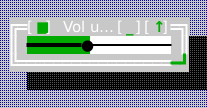
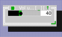
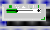
Slider offers SliderPresentation::Line, Block and ProminentThumb.
set_show_value(true) adds a plain numeric value beside the track, with stable
space reserved from the range endpoints. track_bounds() exposes the local
interactive rectangle; readout and tick labels are inert. Tiny widths omit the
readout, keeping the chosen track style. Disabled sliders reject keyboard and
pointer input. Tick labels retain priority, elision and one-cell spacing.
Display variants
All examples below use the same Classic color scheme. These are layout and containment choices configured per widget, rather than color variants.
Line
Block
Prominent thumb
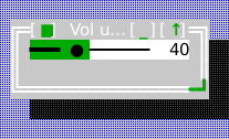
Value readout
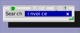
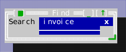
SearchBox
Header: include/cvision/widgets/common_components.hpp. Use for a query field
with search affordance. It owns query editing; the application decides how and
when to execute the search. The query field is an InputLine,
reached through field(), and it is the box's focus stop: focus it with
Application::set_focus(&box.field()). The query is therefore edited as any
one-line field is -- caret movement, Shift and mouse selection, the clipboard
and undo keys -- and every edit reports through on_change. The keys the
field leaves unhandled reach the box: Escape clears a query (and with none is
left for the enclosing dialog), and Enter records it in the history (and is
left for the dialog's default button). A press on the prompt or the status
puts the keyboard in the field. set_status() shows what the search found in the
host's words ("2 of 7", "no match"), right-aligned between the field and the
padded x clear control. The box only draws it: set it again from on_change
after counting. On a narrow box the status is elided before the field gives
up its minimum kMinimumQueryColumns, and it is dropped once no cell of it
fits.
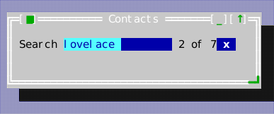
The compiled scene below is the source of this figure.
auto* search = content.make<widgets::SearchBox>();
search->set_bounds(Rect{1, 1, 34, 1});
search->set_query("lovelace");
search->on_change = [search](const std::string& query) {
    (void)query;  // filter the model, then say what it found
    search->set_status("2 of 7");
};
search->on_clear = [] { /* show everything again */ };
search->set_status("2 of 7");
With set_history_key(key) the box shares a list in the application's history
registry: Up and Down recall earlier queries (each recall reports through
on_change, so a live filter follows it), and Enter records the query while
leaving the key for whatever else answers it.
Display variants
All examples below use the same Classic color scheme. These are layout and containment choices configured per widget, rather than color variants.
Flat
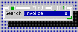
Padded
Underlined
ToolBar
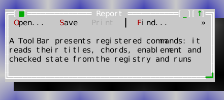
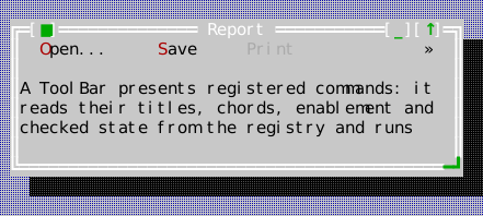
Header: include/cvision/widgets/common_components.hpp. Use to present a
short list of registered commands near document content. Its items are
CommandPresentations, the same values a menu row or a status item presents a
command with, so the label (with its & mnemonic), the chord (shown with
set_show_chords(true)), the enablement and the checked state of a toggle
command (CommandRegistry::set_checked_predicate, drawn [x Wrap]) all come
from the one registry the menus and the status line read.
Choose ToolBarPresentation::Compact (default, one inset cell per side), Padded
(two inset cells per side), or Framed (a padded caption in a three-row single-line box)
with set_presentation(). The first two require one row. Changing the
presentation preserves commands and keyboard position, cancels any armed press,
and notifies the layout of the changed size hints. In manually placed views,
update the bounds to fit the presentation height.
set_groups() accepts a vector of command groups. Empty groups are ignored;
set_items() returns to a single ungrouped row. A separator is drawn only
between visible groups, and is neither clickable nor keyboard-reachable.
Dedicated ckv.toolbar.* roles distinguish focused, hovered, pressed, checked
and disabled buttons. Disabled overrides every interactive appearance; then
pressed, focused, hovered and checked take precedence in that order. A focused
caption is underlined and the toggle mark remains visible in every state.
Pointer feedback applies only to available buttons, not gaps or separators.
Hover is optional and requires terminal motion reports. Enter/Space activate
on release when the terminal reports it, otherwise on press; Escape, resizing,
focus loss and item changes cancel an armed action.
Buttons that do not fit go behind a » control at the right edge, whose
menu lists them with their chords and marks; it opens below the bar, or above
a bar docked at the bottom. The bar is a Tab stop, and activate() hands it
the keyboard from wherever the reader is (bind it to a command of your own for
a docked bar): Left/Right walk the buttons, Enter or Space presses one, a
mnemonic letter runs its button, and Escape hands the keyboard back. A click
never takes the keyboard from the document the command acts on. Dock it with
Desktop::dock(bar, DockEdge::Top) or DockEdge::Bottom, or through
ApplicationShellOptions::tool_bar and tool_bar_edge.
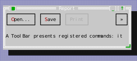
The compiled scene below is the source of this figure.
auto* tools = content.make<widgets::ToolBar>();
tools->set_bounds(Rect{0, 0, 44, 1});
// The presentations a menu row or a status item would use; what does
// not fit goes behind the "»" control at the right edge.
tools->set_groups({{widgets::CommandPresentation{ids.open}, widgets::CommandPresentation{ids.save},
                   widgets::CommandPresentation{ids.print}},
                  {widgets::CommandPresentation{ids.find}, widgets::CommandPresentation{ids.replace_all}},
                  {widgets::CommandPresentation{ids.tile}}});
CommandPalette
Header: include/cvision/widgets/common_components.hpp. Use for searchable
command discovery. It presents an inset search field and an independently
scrollable result viewport, excludes framework-only commands, preserves
mnemonics, shows each command's chord, and activates through the registry
command path rather than a palette-only callback. The match is a
case-insensitive substring of the title as displayed. A command that applies
where the palette answers but is disabled right now is listed greyed, and the
highlight passes over it as a menu's does. Up/Down and the wheel move the
highlight; Enter or a click runs the command. Everything is read from the
registry as it draws, so enablement, rebinding and retraction show at once.
The standard command_palette command (Ctrl+Shift+P, see
Standard commands) puts it up as a popup through
show_command_palette(app, desktop), which a Desktop installs as the
command's default handler: framed, casting a shadow, centred near the top of
the desktop, modal and holding the input capture. It lists what the view
focused when it opened allows, and it is dismissed the way a menu is — Escape
or a press outside it — or by running a command, which it does after the
focus is back where the reader was. A palette embedded in a surface of its own
offers what its focus path allows; one opened in a window of its own takes the
focus away from the place whose commands it should list, so give it that
place's contexts with set_invocation_contexts(ui::command_context_path(view)),
exactly as a menu walk keeps them. set_framed and on_dismiss are the two
halves of the popup presentation, for a host that builds its own.
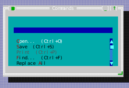
The compiled scene below is the source of this figure.
auto* palette = content.make<widgets::CommandPalette>();
palette->set_bounds(Rect{1, 1, 40, 9});
// An empty query offers everything the registry holds that is not
// framework-only, a disabled command greyed; typing narrows it to the
// titles that contain what was typed. Ctrl+Shift+P puts the same list
// up as a popup over the desktop (show_command_palette).
palette->set_query("");
BreadcrumbBar
Header: include/cvision/widgets/common_components.hpp. Use to display a
hierarchical location. It is a view in normal content chrome, not a replacement
for a TreeView when the user needs expansion/navigation. A path wider than the
bar keeps its first and last segments and elides the middle behind a …
stop; Enter on it, or a click, lists the hidden segments, and choosing one
fires on_activate with its index. hidden_segments() says which ones the
ellipsis stands for at the current width.
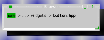
The compiled scene below is the source of this figure.
auto* trail = content.make<widgets::BreadcrumbBar>();
trail->set_bounds(Rect{1, 1, 40, 1});
// Deeper than the bar is wide: the middle is elided behind a "…" that
// lists what it hides.
trail->set_segments({"home", "ada", "ckvision", "include", "cvision", "widgets", "button.hpp"});
trail->set_separator(" > ");
trail->on_activate = [](std::size_t index) { (void)index; /* jump to that level */ };
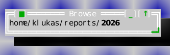
BreadcrumbBar offers BreadcrumbPresentation::Plain, Padded and Connected.
Padded styles include one blank cell on each side of a segment; Connected uses
chevrons between segments. The last level is the current location, shown bold;
keyboard focus adds underline independently. Padding belongs to the segment's
hit region, separators are inert, and overflow retains its hidden-level menu.
Rendering and input reuse prepared geometry. Reconfiguration cancels a pending
ellipsis press; disabled input and clicks outside the bar are rejected.
Display variants
All examples below use the same Classic color scheme. These are layout and containment choices configured per widget, rather than color variants.
Plain
Padded
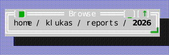
Connected
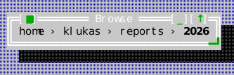
PropertyItem
Header: include/cvision/widgets/common_components.hpp. One row of a
PropertyInspector: a name, a value as canonical text, whether it is editable,
and its PropertyKind — Text, Bool ("true"/"false"), Choice (one of
choices), Integer and Real (within the optional minimum/maximum),
Date (YYYY-MM-DD) or Time (HH:MM or HH:MM:SS). validate is the caller's
own check, run on commit after the kind's: it returns the reason a value is
refused, or std::nullopt. A row written {name, value, editable} is a Text
row.
PropertyInspectorMessages
Header: include/cvision/widgets/common_components.hpp. The reasons a
PropertyInspector gives when it refuses a number itself ("Must be a whole
number", "Must be a number", "Must be at least" and "Must be at most", the
last two followed by the bound). English by default; pass a translated table
to PropertyInspector::set_messages.
PropertyInspector
Header: include/cvision/widgets/common_components.hpp. Use to inspect or
edit a small named set of typed properties. Names stand in a column as wide as
the widest (up to half the view) and values in an aligned second column. Enter
or F2 on an editable row, or a click on its value, edits it in place with the
editor its kind calls for — an InputLine for text and numbers, a pick-only
ComboBox whose list drops at once for a choice, the DatePicker or the
TimePicker — while a Bool row, drawn as a check box, toggles where it stands
on Enter, Space or a click. Enter commits, as do Tab and Up/Down on the way to
another row, and Escape cancels. A commit is checked: the kind's own rule, then
the item's validate. A refused value keeps the editor open and marked
invalid, with the reason on a row of its own under it, until the value is
changed. on_change reports each committed change once, with the canonical
text. Workbench shows a Choice row.
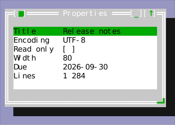
The compiled scene below is the source of this figure.
auto* inspector = content.make<widgets::PropertyInspector>();
inspector->set_bounds(Rect{1, 1, 32, 7});
widgets::PropertyItem encoding{"Encoding", "UTF-8", true, widgets::PropertyKind::Choice};
encoding.choices = {"UTF-8", "Latin-1", "UTF-16"};
widgets::PropertyItem width{"Width", "80", true, widgets::PropertyKind::Integer};
width.minimum = 20;
width.maximum = 200;
inspector->set_items({
    widgets::PropertyItem{"Title", "Release notes", true},
    std::move(encoding),
    widgets::PropertyItem{"Read only", "false", true, widgets::PropertyKind::Bool},
    std::move(width),
    widgets::PropertyItem{"Due", "2026-09-30", true, widgets::PropertyKind::Date},
    widgets::PropertyItem{"Lines", "1 284", false},
});
inspector->on_change = [](std::size_t index, std::string value) { (void)index; (void)value; };
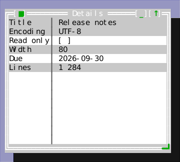
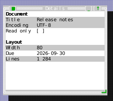
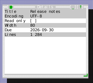
PropertyInspector supports PropertyPresentation::Plain (default), Divided
(a quiet separator between name and value) and Sectioned. An item's owned
group label becomes a heading in Sectioned; consecutive equal labels share one
heading, and later named groups receive a blank preceding row. Empty group
labels add no heading. set_banded_rows(true) independently alternates property
surfaces, using property index rather than the inserted heading/reason rows.
Headings and gaps do not accept clicks or keyboard selection. item_bounds and
value_bounds expose clipped local geometry, and the vertical size hint includes
groups and validation reasons. Changing presentation preserves an open edit and
repositions its editor. Text painting borrows complete graphemes. Disabled direct
input is rejected; validation, canonical values and callbacks stay shared.
Display variants
All examples below use the same Classic color scheme. These are layout and containment choices configured per widget, rather than color variants.
Plain
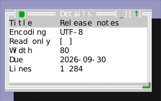
Divided
Sectioned
Banded
WizardPage
Header: include/cvision/widgets/common_components.hpp. Supply a title and a
predicate for forward validity. The predicate is the correct place for the
state-dependent Next policy.
WizardLabels
Header: include/cvision/widgets/common_components.hpp. The words a Wizard
draws — < Back, Next >, Finish, Cancel, and the step indicator's text,
a function of the current page and the page count ("Step 2 of 4") — in the
host's language. An empty step function or text shows no indicator.
Wizard
Header: include/cvision/widgets/common_components.hpp. Use a sequence of
dialog-like pages. The top row carries the page title and, at its right end,
the step indicator; the bottom row carries < Back, Next > (or Finish on
the last page) and Cancel, each operated by its key or by a click where it is
drawn. Next is greyed until the current page's predicate accepts; see
Dialogs. Each page may
have content of its own (set_page_content), laid out between the two rows;
only the current page's shows, and the focus moves with the page when it was
inside the page being left.
The flow ends through on_complete, typed by WizardOutcome: Finished on
the last page, Cancelled by Escape or Cancel. present_modal_wizard presents a
wizard modally in a dialog window of its own and returns a
WizardPresentation — a DialogPresentation<WizardOutcome> that completes
once, after the window has gone, with Cancelled when the window was closed
or taken away some other way.
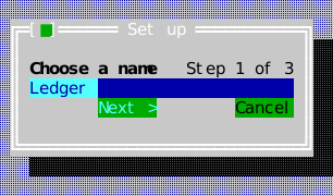
The compiled scene below is the source of this figure.
auto wizard = std::make_unique<widgets::Wizard>();
auto name = std::make_unique<widgets::InputLine>();
name->set_text("Ledger");
const widgets::InputLine* const name_field = name.get();
wizard->set_pages({
    widgets::WizardPage{"Choose a name", [name_field] { return !name_field->text().empty(); }},
    widgets::WizardPage{"Pick a template", {}},
    widgets::WizardPage{"Confirm", {}},
});
wizard->set_page_content(0, std::move(name));
widgets::WizardPresentation setup =
    widgets::present_modal_wizard(std::move(wizard), "Set up", stage.app(), stage.desktop(), stage.roles());
setup.set_completion_handler([](widgets::WizardOutcome outcome) {
    (void)outcome;  // Finished: read the pages' fields; Cancelled: nothing happened
});
Wizard supports WizardPresentationStyle::Compact (default), Bands and
StepRail. Compact retains one-row header/footer chrome; the alternatives add
three-row header/footer bands. StepRail adds a numbered informational step list
with completed/current/pending markers. The rail is inert: validation cannot be
bypassed by clicking a step. Dedicated ckv.wizard.header, .footer and .rail
roles configure the surfaces independently. Tiny bounds clip the chosen layout.
content_bounds, header_bounds, footer_bounds and step_rail_bounds expose
shared clipped local rectangles. Page content follows presentation and resize.
Navigation uses owned Button widgets: Flat in Compact, Padded in the alternates.
back_button, forward_button and cancel_button expose them for focus/access.
Pointer press/release cancellation and release-reporting keyboard activation
follow Button. Wizard focus underlines its title; button focus and default action
emphasis remain independent. Page-field Enter, Left/Right and Escape retain their
flow shortcuts. Disabled direct input is rejected. Call refresh_navigation
when external validation dependencies change; rendering also checks availability,
and commit callbacks recheck validation. Step formatter output and numbered rail
captions are prepared on page/label changes; rendering borrows complete graphemes.
Display variants
All examples below use the same Classic color scheme. These are layout and containment choices configured per widget, rather than color variants.
Compact
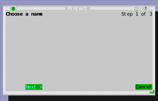
Bands
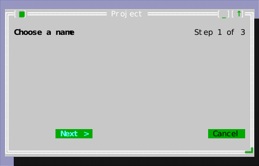
Step rail
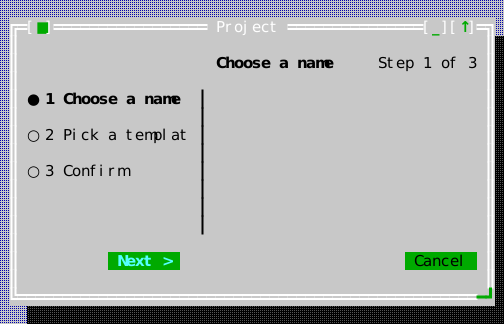
Notification
Header: include/cvision/widgets/common_components.hpp. A severity/message/
dismissibility record owned by NotificationCenter. persistent decides
whether time may take it away: a persistent notification waits for the reader
however long that takes, everything else expires on the interval its centre
was given.
NotificationCenter
Header: include/cvision/widgets/common_components.hpp. Use for non-modal
application feedback. It does not replace a modal message box when a decision
or acknowledgement is required.
set_auto_dismiss(nanos) is what turns it into a toast surface: a
non-persistent notification leaves by itself that long after it was posted,
measured on the injected Clock. Zero — the default — is no expiry at all, so a
consumer written before this behaves exactly as it did. Each notification is
timed from when it was posted, and everything due at one moment leaves in one
sweep; changing the interval re-times what is already on screen.
The reader can dismiss any line, persistent included, by clicking it; Escape
takes the most recent. on_changed fires whenever the set moves for any
reason — a post, a dismissal, or an expiry — which a host needs because expiry
happens on a timer it never sees, and a centre that emptied itself would
otherwise leave the host holding a rectangle for rows that are gone.
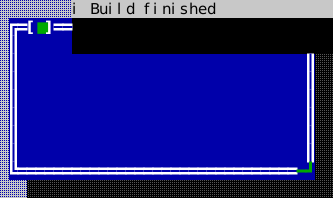
An empty centre paints nothing, and a centre with two lines paints two rows. So a host may leave one lying over its content at a generous size instead of resizing it on every post: the cells it does not write show what is beneath.
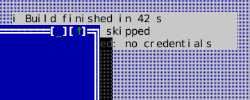
The compiled scene below is the source of this figure.
auto* centre = stage.desktop().make<widgets::NotificationCenter>();
centre->set_bounds(Rect{40, 2, 36, 6});
centre->set_auto_dismiss(4'000'000'000);  // 4s for everything not persistent
centre->add(widgets::Notification{widgets::NotificationSeverity::Info,
                                  "Build finished in 42 s", false});
centre->add(widgets::Notification{widgets::NotificationSeverity::Warning,
                                  "2 tests were skipped", false});
centre->add(widgets::Notification{widgets::NotificationSeverity::Error,
                                  "Upload refused: no credentials",
                                  /*persistent=*/true});
centre->on_changed = [] { /* a post, a dismissal or an expiry */ };
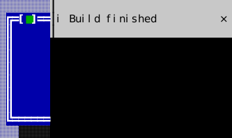
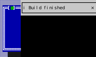
NotificationCenter offers NotificationPresentation::Lines, Banners and
Framed. Lines retains compact whole-line dismissal. Alternate presentations
use three-row cards with a transparent one-row gap, severity markers and an
unbracketed × dismissal control. Card content and gaps are inert. Escape
dismisses the newest entry; focused alternate content is underlined.
notification_bounds() and dismiss_bounds() expose clipped local geometry.
Expiry, persistence and callbacks remain shared. Disabled input is rejected.
NotificationCenter's vertical size hint includes the full stack and intervening card gaps, independent of its live bounds; a larger explicit preferred height is respected. Posting, dismissal, expiry and presentation changes notify layout parents. Hosts using fixed bounds may instead choose how much of the stack to show.
Display variants
All examples below use the same Classic color scheme. These are layout and containment choices configured per widget, rather than color variants.
Lines
Banners
Framed
Tooltip
Header: include/cvision/widgets/common_components.hpp. Use for short
contextual help; it is not a focusable dialog. A host may place one itself
with show_at, or beside an anchor with show_near, which puts it on the row
below the anchor, above it when there is no room below, and over the anchor's
last row when there is neither, moved left until it ends inside the area — the
same geometry always gives the same place. Held (set_held), it answers input
the way an open menu does: any key, or a press anywhere, fires on_dismiss.
A TooltipController shows one here, the tooltip key having asked for the focused button's tip:
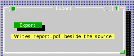
The compiled scene below is the source of this figure.
// Kept by the application for as long as it has tips to show.
widgets::TooltipController tips(stage.app(), stage.desktop());
tips.set_tip(*button, "Writes report.pdf beside the source");
// The pointer resting on the button, or the focus arriving on it, shows
// the tip after tips.delay_nanos(); the tooltip key (Ctrl+F1) at once.
stage.focus(button);
tips.show_for_focus();
TooltipController
Header: include/cvision/widgets/common_components.hpp. Shows the tips of an
application's views. The host names each view's tip with set_tip; a view
without one shows its nearest ancestor's. When the pointer rests on a view, or
the focus arrives on one, its tip appears after set_delay (500 ms by
default), measured on the Application's injected clock, under the pointer's
cell or under the view. That tip is passive: it goes when the pointer or the
focus leaves the view, or at the next key, press, wheel turn or text input, and
the reader may move the pointer onto it to read it.
The tooltip command (CommandRegistry::standard().tooltip, Ctrl+F1 by
default, available inside modal dialogs too) shows the focused view's tip at
once. That tip is held with a menu's dismissal discipline: it keeps a modal
scope and the pointer, Escape or any other key or a press anywhere puts it
away, and nothing reaches the application behind it meanwhile — so Escape
closes the tip and not the dialog under it. The controller installs the
command's handler only when nothing has claimed it, and gives it back when it
is destroyed.
Desktop
Header: include/cvision/widgets/desktop.hpp. Insert one below the
Application root. It owns window z-order, docks, popups, activation, and
desktop-wide tile/cascade commands; do not use a global desktop singleton.
dock(view, DockEdge) (or dock_top/dock_bottom) docks chrome to an edge.
Each edge holds a stack: the first view docked sits against the edge and each
later one inward of it, so a tool bar docked after the menu bar sits under it
and one docked after the status line sits above it. docked(edge) lists a
stack from the edge inward; every docked view reserves its rows from
content_area(), and removing one closes the stack up.
Focus and activation are one answer (D-107). Focusing a view inside a window —
by a click, Tab, a mnemonic, a focus restoration or the application's own
Application::set_focus() — activates and raises that window
(View::on_descendant_focused), so the keyboard never sits in a window drawn
inactive. Focusing a docked bar or a popup leaves the activation alone. The
other way round, activating a window carries the focus into it: F6 and
Shift+F6, Alt+1…9, a click on its frame or title, the window list's Switch To,
a switcher-bar entry, add_window, activate(), a restored snapshot and the
successor that takes over from a closed or minimized window all hand the
keyboard to the view that last held it in that window, which the Desktop
remembers per window, or, the first time or once that view has gone, to the
window's first focus stop (Application::first_focus_stop). A press on a
focus stop leaves the focus to click-to-focus, so the remembered view never
has it in between. A window with no focus stop takes the focus away from the
window that lost activation. A presentation (present_modal,
present_modeless) focuses the handle's initial view itself.
test_activation_focus_scripts.cpp:
f6_and_shift_f6_carry_the_focus_to_the_view_each_window_last_had,
a_title_bar_click_activates_the_window_and_brings_back_its_last_focus,
the_window_lists_switch_to_hands_the_focus_to_the_chosen_windows_last_view.
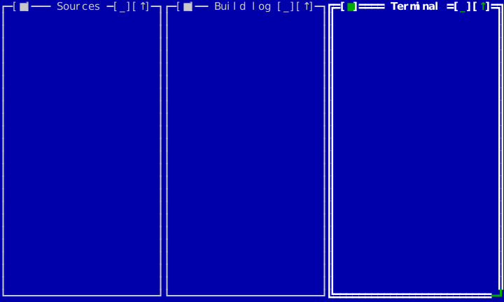
The compiled scene below is the source of this figure.
for (const char* title : {"Sources", "Build log", "Terminal"}) {
    auto frame = std::make_unique<widgets::Window>(title);
    frame->set_content(std::make_unique<ui::View>());
    stage.desktop().add_window(std::move(frame));
}
stage.desktop().tile();  // or cascade(); both are desktop-wide commands
The background. set_background_painter(painter) lets an application draw
on the desktop itself — a logo, a watermark, a board of figures. The desktop
fills itself with its pattern (U+2591 in ckv.desktop.background) and then
calls the painter with a scene::Painter clipped to the area between the
docks and that area, in the desktop's own view coordinates. The hook runs
when the desktop's own surface is repainted and at no other time: windows
opening, closing, moving or changing their content over it are composition,
so an application whose picture has changed calls invalidate() on the
desktop. Like the docks, the background belongs to the view and does not pan.
A world larger than the view of it (U7-a)
A Desktop is its own viewport until a host says otherwise. set_extent()
makes the world it contains bigger than the hole it is seen through, and
set_pan() says which part of that world the hole is over. pan_to_show(rect)
moves the view the least distance that brings a world rect fully into it —
what a host calls when a reader focuses a window that is off-screen.
Two vocabularies, and every call site belongs to exactly one:
| Reads | Examples | |
|---|---|---|
| World | extent(), content_area() | window bounds(), the tilings, the cascade, filled_tile_fractions(), the remembered arrangement (D-058) |
| View | the desktop's own bounds(), pan() | where things are drawn, where a click lands, docked chrome |
An arrangement is a statement about the world and does not change because
somebody looked elsewhere. That is enforced rather than asked for: panning sets
each window's View::set_paint_offset, which moves where a view is DRAWN
without touching its bounds(). A host whose window rects are shared state —
ckmux's are session state held by a server and seen by two readers — can pan
one reader's view without restating anybody's arrangement.
Drawing and hit-testing cannot disagree, because the offset is applied in the
three places that compose coordinates: both child-painting paths and
absolute_bounds(). A view drawn somewhere is hit-tested there.
Docked chrome does not pan. A menu bar that scrolled off the top of the screen would not be a menu bar, so the docks keep their own position and full view width; popups likewise stay where they were put, since a dropdown belongs to the bar it hangs from and a context menu was opened at a place on the screen.
With no extent set, the world is the desktop's own bounds and every answer is what it has always been — which is the regression bar for the feature: a viewport equal to the extent must be invisible to a consumer that never asked for one.
Four tilings, each a standard command Desktop installs a default handler
for: tile()/tile_horizontally() (full-height bands side by side in a row
— the same arrangement under two names, because ckv.window.tile is a command
applications already bind), tile_vertically() (full-width bands stacked top
to bottom) and tile_grid() (a near-square grid of ceil(sqrt(n))
columns, its short last row stretched across the full width). All of them
fill content_area() exactly, leaving no gap row or column.
"Every window" means every window on the desktop: a minimized one (and one an
application hid itself) gets no band, and the area is divided by the count of
the rest — otherwise the arrangement would leave a gap exactly where the
hidden window's band would have been. cascade() skips them for the same
reason, activate_next/activate_previous step over them, and
filled_tile_fractions() does not count them. activate() is the exception
and restores one instead: naming a window is asking for it, and an activation
pointing at something nobody can see is the incoherence every other rule here
exists to avoid.
filled_tile_fractions() reports the current arrangement as a fraction of
content_area() per window — but only while that arrangement really is a
filled, non-overlapping tiling, which it measures geometrically rather than
recording when a tile command runs. A host restoring a saved layout onto a
differently sized desktop lays the fractions back down and keeps a 50/50
split 50/50. The same detection suppresses window shadows while the desktop
is filled: a shadow says "this floats above that", and a full tiling leaves
no desktop between the windows for one to fall on.
An arrangement survives a resize. A Desktop remembers the cells of the last
arrangement that was stated — by tile(), tile_horizontally(),
tile_vertically(), tile_grid(), restore(), or by a reader's own drag or
resize ending in a tiling — together with the content area they were stated in,
and re-divides them by the same proportions whenever the content area changes.
It is the proportions that survive, not the cell sizes: a band of a 23-row
desktop is one row shorter than the same band of a 24-row one, and returning to
a size the arrangement was already laid out in returns exactly the cells it had
there. The arrangement is forgotten when one of its own windows leaves the
desktop, when a reader moves or resizes one of them out of its cell, or when the
content area becomes too small to give every cell a row and a column — two
stacked bands need two rows, not eight. A window merely opening over the tiling
suspends the filled_tile_fractions() verdict for as long as it covers part of
the grid, without disturbing the arrangement underneath. A window that is zoomed
or carries a DesktopGrowPolicy other than None is already sized on every
resize by that policy, and an arrangement containing one is not remembered at
all: no window is sized by two authorities.
set_maximize_follows_active(true) opts in to a new window opening
maximized when the window active at the moment of creation was maximized.
Off by default, and it reuses Window's own zoom, so the frame's zoom
control restores such a window normally. Standard-dialog presentation
(present_modeless/present_modal/exec_modal) is outside the policy: a
dialog opens at the size it was built for.
subscribe_window_change(observer) reports a window being added, removed,
activated, renamed, minimized or restored. It exists for views that list
windows rather than contain them — a switcher bar, a navigator pane —
because nothing else
invalidates such a view when a window it does not contain opens or is
renamed, and its list would silently stop matching the desktop. The overload
taking a std::weak_ptr<void> drops the observer once that token expires,
which is what a view docked on the same desktop needs: it is destroyed as
part of that desktop, and a destructor cancelling by hand would reach into a
Desktop whose members are already gone. An observer is a notification, not
a place to add, remove or activate windows — post that work instead.
FieldDescriptor
Header: include/cvision/widgets/dialog.hpp. A label/initial-value/validator
record used to materialize a descriptor dialog. kind selects the control:
Text (an InputLine, the default), Memo (a multi-line text field whose
memo_rows controls its requested visible height), Check (a checkbox carrying
the label as its own text) or Note (text the form states rather than asks). Its
description is what a form's description panel shows while the field has the
focus. history_key gives a Text, Number or Combo field a list in the
application's history registry: the field recalls its entries, and accepting
the dialog records the answer. See
Dialogs.
ButtonDescriptor
Header: include/cvision/widgets/dialog.hpp. Defines a dialog action: its
label, its own handler, and a ButtonRole saying what pressing it does to the
dialog — Accept (the default button: validate, answer, close), Dismiss
(close exactly as Esc does, with no answer) or Neutral (run the handler and
stay, as Apply or Browse… do). Neutral is the default, so a button that ends
the dialog states which way it ends it.
DialogDescriptor
Header: include/cvision/widgets/dialog.hpp. Use for a standard form dialog
when declarative fields and validation are sufficient; see Dialogs.
It can reserve a measured minimum framed size and align its action row. Set
anchor_buttons_to_bottom when the measured height deliberately leaves room
beneath the fields; the actions remain at the lower edge while the fields
retain their ordinary layout and validation semantics.
Its public configuration is synchronized directly from the declaration:
| Field | Type | Default |
|---|---|---|
title | std::string | — |
fields | std::vector<FieldDescriptor> | — |
buttons | std::vector<ButtonDescriptor> | — |
resizable | bool | false |
minimum_window_size | Size | {} |
button_alignment | ui::Alignment | ui::Alignment::Start |
anchor_buttons_to_bottom | bool | false |
field_description_rows | int | 0 |
help_context_key | std::string | {} |
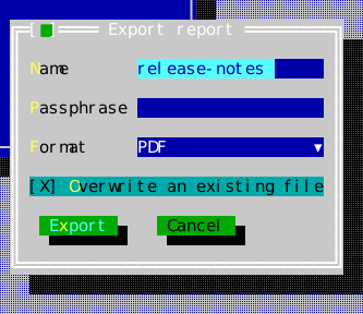
The compiled scene below is the source of this figure.
widgets::DialogDescriptor descriptor;
descriptor.title = "Export report";
widgets::FieldDescriptor name;
name.label = "&Name";
name.initial_text = "release-notes";
descriptor.fields.push_back(std::move(name));

widgets::FieldDescriptor passphrase;
passphrase.label = "&Passphrase";
passphrase.password_echo = true;
descriptor.fields.push_back(std::move(passphrase));

widgets::FieldDescriptor format;
format.label = "&Format";
format.kind = widgets::FieldKind::Combo;
format.options = {"PDF", "HTML", "Plain text"};
format.initial_selection = 0;
descriptor.fields.push_back(std::move(format));

widgets::FieldDescriptor overwrite;
overwrite.label = "&Overwrite an existing file";
overwrite.kind = widgets::FieldKind::Check;
overwrite.initial_checked = true;
descriptor.fields.push_back(std::move(overwrite));

descriptor.buttons = {
    widgets::ButtonDescriptor{"E&xport", widgets::ButtonRole::Accept, [] {}},
    widgets::ButtonDescriptor{"Cancel", widgets::ButtonRole::Dismiss, [] {}},
};

widgets::DescriptorDialogPresentation dialog =
    widgets::present_modal_dialog(std::move(descriptor), stage.app(), stage.desktop(), stage.roles());
dialog.set_completion_handler([](widgets::DialogResult result) {
    (void)result;  // .accepted, plus one value per field
});
MaterializedDialog
Header: include/cvision/widgets/dialog.hpp. The materialized view/result of
a descriptor; normally use present_modal_dialog instead of manually managing it.
Its tree always has the same shape: the fields inside a ScrollViewport
(content_viewport), and the button row that viewport's sibling, below it.
There is no second shape for a dialog that does not fit, because a dialog
cannot know at materialization time how much room it will be given and is
given a different amount every time the terminal is resized. Only the layout
varies, and it is recomputed from the height the dialog actually has:
- Room for everything — the viewport is exactly as tall as the fields need,
the buttons sit directly under it, and the
Autovertical bar stays off screen. Nothing about the result differs from a dialog built before any of this existed: same rows, same columns, no reserved track. - Not enough room — the buttons keep the bottom rows and the viewport takes what is left. The fields scroll by the bar, by the keyboard, and by the wheel where the field under it does not want it; Tab and Shift-Tab still reach every field, scrolling it into view rather than leaving the cursor off screen; and the accept-time validation veto scrolls the offending field into view as it focuses it. The buttons never scroll away — a dialog that cannot show its Save and Cancel is not merely cramped, it is unusable.
Horizontal scrolling is off: a form whose left column has scrolled away is not a view of that form.
A dialog opened with present_modal_dialog/exec_modal_dialog takes its own recommended
height, clamped to what the desktop can show, and re-answers that on every
desktop resize: a terminal that shrinks below the form turns the dialog into a
scrolling one, and a terminal that grows again gives its full height back. A
resizable descriptor is left alone once it is open — the reader has a resize
grip, so the size is theirs. wire_dialog_window does not re-fit a
caller-owned window at all; the window and its geometry policy belong to the
caller.
DialogVeto
Header: include/cvision/widgets/dialog.hpp. What DialogDescriptor::check
returns when the answers as a whole cannot be accepted: the message the form's
description panel shows, and the field to put right. See
Checking the whole answer.
DialogResult
Header: include/cvision/widgets/dialog.hpp. Typed completion payload for a
descriptor dialog. Inspect it in the presentation completion handler.
DialogFocusRestore
Header: include/cvision/widgets/dialog_presentation.hpp. Presentation helper
that restores the invoking focus after modal close; use the public presentation
functions rather than constructing it directly.
PendingDialogs
Header: include/cvision/widgets/dialog_presentation.hpp. The dialogs an owner
is waiting on. A presentation delivers its completion only while it is kept, so
an application that asks many questions hands each presentation to one
PendingDialogs member with what to do with the answer —
pending.await(present_modal_dialog(...), on_answer) —
instead of keeping an optional member per dialog. Each is released as its
answer arrives, before the answer runs, so a completion may present the next
dialog of a chain; destroying the set withdraws every answer still outstanding.
DialogPresentationAccess
Header: include/cvision/widgets/dialog_presentation.hpp. Internal access
surface for typed presentations; clients consume the typed aliases returned by
the standard present_modal_* and present_modeless_* functions.
DirectoryPickerResult
Header: include/cvision/widgets/directory_picker.hpp. Typed result from the
directory-picker presentation. Inject a FileSystem; never make the widget read
the disk implicitly.
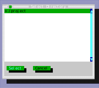
The compiled scene below is the source of this figure.
widgets::DirectoryPickerPresentation picker = widgets::present_modal_directory_picker(
    fs, "/project", stage.app(), stage.desktop(), stage.roles());
picker.set_completion_handler([](widgets::DirectoryPickerResult result) {
    (void)result;  // {accepted, path}
});
FileDialogFilter
Header: include/cvision/widgets/file_dialog.hpp. Describes a displayed file
filter for the standard open/save dialog.
FileDialogOptions
Header: include/cvision/widgets/file_dialog.hpp. Options record for the
standard file dialog, including mode and filters. suggested_name offers a
name for something the application can already name — Save As for
notes.md, an export beside it as notes.html: the path field reads the
shown directory with that name wherever the reader browses, and has the focus,
so Enter accepts it. In either mode, choosing a file in the list puts its path
in the path field and the focus there: Enter accepts the file, typing edits the
name. recent_locations_key names a list in the application's history
registry: the dialog lists the still-existing directories on it as "Recent:"
rows at the top of the listing and records the shown directory on accept, so
every file dialog naming the key shares one list of recent places.
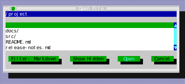
The compiled scene below is the source of this figure.
widgets::FileDialogOptions options;
options.filters = {widgets::FileDialogFilter{"Markdown", {".md"}},
                   widgets::FileDialogFilter{"All files", {}}};
options.active_filter = 0;

widgets::FileDialogPresentation picker = widgets::present_modal_file_dialog(
    widgets::FileDialogMode::Open, "/project", fs, options, stage.app(), stage.desktop(),
    stage.roles());
picker.set_completion_handler([](widgets::FileDialogResult result) {
    (void)result;  // {accepted, path}
});
FileDialogResult
Header: include/cvision/widgets/file_dialog.hpp. Typed result from an
open/save presentation.
HelpTopic
Header: include/cvision/widgets/help_viewer.hpp. A topic as your
HelpProvider supplies it: a title, a body of HelpSpan runs, and a curated
"see also" list of (topic key, label) pairs. The viewer draws every
cross-link — a linked run of the body and every see-also label — as a link of
its prose pane.
HelpSpan
Header: include/cvision/widgets/help_viewer.hpp. One run of a topic's prose:
text, and for a cross-link the key of the topic it leads to. A provider
converting from its own storage emits the runs its parser finds, so the
library needs no link markup of its own: {{"Windows move by their "}, {"title bar", "chrome"}, {"."}} is a sentence with one link.
HelpIndexEntry
Header: include/cvision/widgets/help_viewer.hpp. Search/index record emitted
by a help provider.
HelpProvider
Header: include/cvision/widgets/help_viewer.hpp. Abstract, injected source
of help topics. It keeps help content under application ownership.
MemoryHelpProvider
Header: include/cvision/widgets/help_viewer.hpp. Deterministic in-memory
provider suitable for small applications and tests; Forms uses it. Its search
matches a topic's key, title, body text, cross-link keys and see-also labels.
In the viewer (make_help_viewer, present_modeless_help_viewer) Tab moves from the
index to the prose, where it walks the cross-links in reading order before
moving on to Back and Close; Enter or a click follows a link. Following a link
or choosing a topic in the index shows that topic from its top and remembers
the one left; Back returns along that trail and is disabled while there is
nothing to return to.
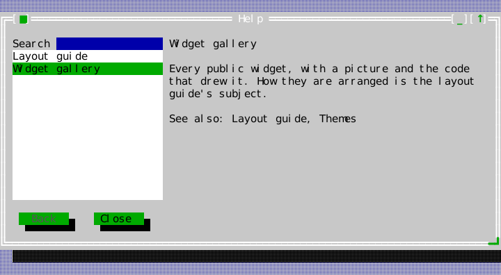
The compiled scene below is the source of this figure.
provider.add_topic("gallery",
                   widgets::HelpTopic{"Widget gallery",
                                      {{"Every public widget, with a picture and the code that "
                                        "drew it. How they are arranged is the "},
                                       {"layout guide", "layout"},
                                       {"'s subject."}},
                                      {{"layout", "Layout guide"}, {"themes", "Themes"}}});
provider.add_topic("layout", widgets::HelpTopic{"Layout guide", {{"Row, Column, Grid, Dock."}}, {}});

widgets::HelpViewerPresentation help = widgets::present_modeless_help_viewer(
    provider, "gallery", stage.app(), stage.desktop(), stage.roles());
help.set_completion_handler([](widgets::HelpViewerResult result) { (void)result; });
ImageView
Header: include/cvision/widgets/image_view.hpp. Use to display an Image.
It renders raster output if the terminal supports it and a cell fallback if it
does not; Graphics shows both captures. on_click receives
every mouse event with its cell and any reported pixel, and image_pixel_at()
names the picture pixel under that pixel. The view consumes every mouse event
except the wheel: a picture does not scroll, so a wheel notch over it goes on
to the ScrollViewport around it, which does.
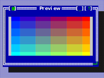
The compiled scene below is the source of this figure.
auto* preview = content.make<widgets::ImageView>();
preview->set_bounds(Rect{1, 1, 30, 7});
preview->set_image(gradient_image(240, 120));
preview->set_stretch_to_fill(false);  // keep the picture's own aspect
preview->on_click = [](const MouseEvent& event) {
    (void)event;  // carries both the cell and the pixel it was in
};
FlowText
Header: include/cvision/widgets/flow_view.hpp. A styled text run, optionally
with a link target, inside a FlowDocument block.
FlowLineBreak
Header: include/cvision/widgets/flow_view.hpp. An explicit visual line break
inside a flow block.
FlowImage
Header: include/cvision/widgets/flow_view.hpp. An inline raster atom with a
cell extent and required text fallback.
FlowBlock
Header: include/cvision/widgets/flow_view.hpp. An ordered group of flow
atoms separated from adjacent blocks by a blank row.
FlowDocument
Header: include/cvision/widgets/flow_view.hpp. The application-owned value
set on a FlowView; see Flow content for composition and link
handling.
FlowView
Header: include/cvision/widgets/flow_view.hpp. Use for wrapped styled
read-only content with keyboard and pointer link navigation plus inline raster
atoms. Workbench's text tab provides the compiled example. A scrolled inline
picture is drawn again at its new anchor, which may start above the first row
shown, and clipped to the rows in view and the columns left of the scrollbar
(D-081); the picture is never cut into a new image, so each of its rows keeps
its pixels as it moves.
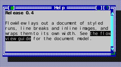
The compiled scene below is the source of this figure.
widgets::FlowBlock heading;
heading.content.push_back(widgets::FlowText{"Release 0.4", Attr::Bold, std::nullopt});

widgets::FlowBlock body;
body.content.push_back(widgets::FlowText{"FlowView lays out a document of ", Attr{}, std::nullopt});
body.content.push_back(widgets::FlowText{"styled runs", Attr::Underline, std::nullopt});
body.content.push_back(widgets::FlowText{", line breaks and inline images, and wraps them to its own width. See ", Attr{}, std::nullopt});
body.content.push_back(widgets::FlowText{"the flow view guide", Attr{}, std::string("flow-view.md")});
body.content.push_back(widgets::FlowText{" for the document model.", Attr{}, std::nullopt});

widgets::FlowDocument document;
document.blocks = {std::move(heading), std::move(body)};
flow->set_document(std::move(document));
flow->on_link_activate = [](const std::string& target) { (void)target; /* follow it */ };
FrameText
Header: include/cvision/widgets/frame_text.hpp. Use for a short readout set
into a window's border — a line and column, a page count, the path being
browsed — with Window::add_frame_overlay. It wears the border's own style
(Window::frame_style()), so it follows the window's activation and any role
override the window carries, and paints only its text and a space either side:
the rest of its reserved width stays border line. set_reserved_width keeps a
changing readout from moving along the border; set_alignment places the text
within that width.
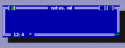
The compiled scene below is the source of this figure.
auto* position = window.add_frame_overlay(std::make_unique<widgets::FrameText>("12:4"),
                                          widgets::FrameSlot{widgets::Edge::Bottom, ui::Alignment::Start, 1});
position->set_reserved_width(10);  // a longer line number does not move it
position->set_text("12:4  *");     // the caret moved and the page changed
InputLine
InputLine, ComboBox and SearchBox share InputPresentation
(include/cvision/widgets/input_presentation.hpp). Flat is the default colored
surface. Padded adds one cell at either side; Underlined adds the same padding
and a second row with a rule. Configure set_presentation() per instance. Bounds
smaller than the requested size clip the chosen presentation. No field uses
ornamental brackets. input_content_rect() and input_presentation_height()
define the geometry; InputLine exposes it through content_bounds(). The caret,
selection, Unicode scroll and mouse positions all use the content rectangle.
Padding and the rule have no editing pointer or click action. Changing style
preserves text, selection and undo, and cancels an active selection drag.
Header: include/cvision/widgets/input_line.hpp. Use for one-line text with
grapheme-aware editing, selection, validation, optional per-grapheme admission
filtering, masks, password echo, history, clipboard, and undo. Text events
edit it; arrows/home/end and mouse adjust its
cursor/selection. Ctrl+Left/Right moves by word, Ctrl+Home/End reaches the
field boundaries, and Shift extends any cursor motion. Ctrl+C/X/V and
Ctrl+Insert/Shift+Insert copy, cut, and paste; Ctrl+Backspace/Delete erase by
word, while Shift+Delete cuts the selection. Forms shows a labelled field.
on_accept reports Enter; on_edited reports each change the reader makes to
the text — what a search box filters on as it is typed into — and not the
owner's own set_text(). A field the focus reaches from the keyboard — a dialog
opening on it, Tab, the focus coming back — offers its text selected with the
caret at the end: typing replaces it, Backspace or Delete clears it, and Right,
End, Left, Home or Insert keep it and edit from there. A pointer press places
the caret where it lands instead (D-066), and so does an owner's set_cursor()
— a formula line seeded with the reader's first keystroke, say, continues
after it rather than offering it for replacement.
History is the application's, never the field's: set_history_key(key) names
a list in Application::history(), Up and Down cycle through it, and the
owner calls commit_to_history() when it considers the text accepted. Every
input line, combo box, search box, descriptor-dialog field
(FieldDescriptor::history_key) and file dialog
(FileDialogOptions::recent_locations_key) naming the same key reads and
records the one list, so a query typed in one place is offered in all of them.
A field that is not attached to an application has no history to use.
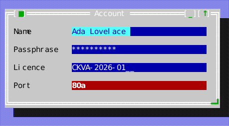
The compiled scene below is the source of this figure.
auto* name = content.make<widgets::InputLine>();
name->set_bounds(Rect{14, 1, 30, 1});
name->set_text("Ada Lovelace");

auto* secret = content.make<widgets::InputLine>();
secret->set_bounds(Rect{14, 3, 30, 1});
secret->set_password_echo(true);
secret->set_text("analytical");

auto* serial = content.make<widgets::InputLine>();
serial->set_bounds(Rect{14, 5, 30, 1});
// '9' a digit, 'A' a letter, '*' anything; everything else is a
// literal the reader cannot edit and the cursor skips. Setting a
// mask resets the field to placeholders, so set it before the value.
serial->set_mask("AAAA-9999-9999");

auto* port = content.make<widgets::InputLine>();
port->set_bounds(Rect{14, 7, 30, 1});
port->set_validator([](const std::string& text) { return text.find_first_not_of("0123456789") == std::string::npos; });
port->set_text("80a");
port->set_valid(false);  // draws in the invalid role until it validates
Display variants
All examples below use the same Classic color scheme. These are layout and containment choices configured per widget, rather than color variants.
Flat
Padded
Underlined
KeyChordCapture
Header: include/cvision/widgets/key_chord_capture.hpp. Use for editing a
single command shortcut without allowing the captured chord to trigger that
command. Focus the control and press Enter or Space to begin capture; the next
key press becomes its typed KeyChord. Escape abandons capture, while
Backspace or Delete clears a binding. The application owns conflict analysis,
rebinding, and persistence through its CommandRegistry; this widget has no
keymap or filesystem policy of its own. The Workbench example's File → Keys…
dialog is a complete rebinding surface built from it: one capture per command,
each change unbinding the command's chords and binding the captured one.
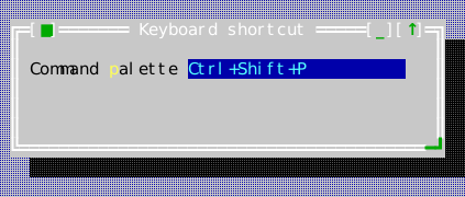
The compiled scene below is the source of this figure.
auto* shortcut = content.make<widgets::KeyChordCapture>();
shortcut->set_bounds(Rect{17, 1, 22, 1});
shortcut->set_chord(KeyChord{Key::Char, Modifier::Ctrl | Modifier::Shift, "p"});
shortcut->on_chord_changed = [](const std::optional<KeyChord>& chord) {
    (void)chord;  // validate conflicts, then persist the typed chord
};

auto* label = content.make<widgets::Label>("Command &palette");
label->set_bounds(Rect{1, 1, 15, 1});
label->set_buddy(shortcut);
Label
Header: include/cvision/widgets/label.hpp. Use a mnemonic label next to a
control; it participates in mnemonic focus routing. Use StaticText for passive
wrapped copy. In a column of labels laid out in rows, set_column_width(cells)
makes each label at least the column's width, so the controls beside them start
at the same place — descriptor dialogs line up their labels this way.
The compiled scene below is the source of this figure.
auto* host = content.make<widgets::InputLine>();
host->set_bounds(Rect{12, 1, 22, 1});
host->set_text("db.internal");

auto* label = content.make<widgets::Label>("&Host name");
label->set_bounds(Rect{1, 1, 11, 1});
label->set_buddy(host);  // Alt+H now focuses the field, not the label
ListItem
Header: include/cvision/widgets/list_view.hpp. A stable item identity, text,
and optional presentation style returned by a ListModel.
ListModel
Header: include/cvision/widgets/list_view.hpp. A caller-owned synchronous
visible-slice provider for ListView. It supplies reverse identity lookup so
selection survives refreshes and reordering; see Data views.
ListView
set_banded_rows(true) adds a subtle alternate surface through
ckv.list.banded. Absolute display-row parity keeps the bands stable while
scrolling. Selection and explicit item styles take precedence; empty rows remain
plain. Plain is the default.
Header: include/cvision/widgets/list_view.hpp. Use a linear selectable
collection. Arrow keys select and Enter activates; a press selects the row
under it, a double click activates it, and the wheel scrolls the rows without
moving the cursor. File Browser connects it to TreeView selection. For dynamic or large data, set a ListModel rather than
materializing rows. Typing searches: letters typed within a second of each
other form one prefix, so sa reaches "sample" past "parts", while a letter
typed alone — or the same letter again — steps to the next row beginning
with it (D-070); a provider answers the search through find_prefix. A row
that carries its own style keeps its colouring under the cursor and the
selection, drawn over it as CellGrid draws over a coloured cell (D-067).
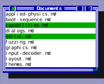
The compiled scene below is the source of this figure.
list->set_items({"applied-physics.md", "boot-sequence.md", "capabilities.md",
                 "dialogs.md", "editor.md", "fuzzing.md", "graphics.md",
                 "input-decoder.md", "layout.md", "themes.md"});
list->set_cursor(2);
list->set_selected(2, true);
list->set_selected(4, true);
list->set_scrollbar_policy(widgets::ScrollbarPolicy::Auto);
list->on_activate = [](std::size_t index) { (void)index; /* open the row */ };
list->on_selection_changed = [](std::size_t index) { (void)index; };
Display variants
All examples below use the same Classic color scheme. These are layout and containment choices configured per widget, rather than color variants.
Plain
Banded
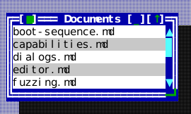
Memo
Header: include/cvision/widgets/memo.hpp. Use for multiline editable text
with undo and optional wrapping. It handles cursor keys, text input, scrolling,
and clipboard through Application services. It uses the same editing keymap as
InputLine: Ctrl+Left/Right moves by word, Ctrl+Home/End reaches document
boundaries, Shift extends selections, and Ctrl+C/X/V or
Ctrl+Insert/Shift+Insert provide clipboard operations. Ctrl+Backspace/Delete
erase by word; Shift+Delete cuts the current selection. A press places the
caret, a drag selects, a double click selects the word under it, and the wheel
scrolls without moving the caret.
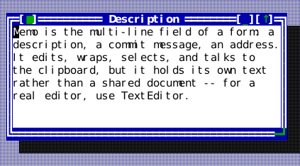
The compiled scene below is the source of this figure.
memo->set_text(
    "Memo is the multi-line field of a form: a description, a commit "
    "message, an address.\n"
    "It edits, wraps, selects, and talks to the clipboard, but it holds "
    "its own text rather than a shared document -- for a real editor, use "
    "TextEditor.");
memo->set_wrap_mode(widgets::WrapMode::Word);
memo->set_vertical_scrollbar_policy(widgets::ScrollbarPolicy::Auto);
MnemonicText
Header: include/cvision/widgets/mnemonic.hpp. Parsed label/mnemonic value
used by controls that accept & mnemonic notation.
MenuItem
Header: include/cvision/widgets/menu.hpp. A menu row, and exactly one kind
of row: MenuItem::command(), MenuItem::action(), MenuItem::submenu() or
MenuItem::separator(). The kind comes from the named constructor that made
the row rather than from which of several optional fields happen to be filled
in, so "a separator that also has a submenu" is not a state a menu can be
asked to draw.
Prefer a command row: its wording, chord hint and availability come from the registry, so the menu cannot disagree with the palette or the status line about them. A callback row is for a genuinely local action — opening a contextual dialog — and carries its own label and its own enabled flag, because nothing else could know either.
Refinements chain onto any row: .with_mark() puts a fixed check box or radio
mark in the left column. .with_mark_provider() reads a callback for a live
mark when application state changes after menu construction; return RadioOn
for the selected choice and RadioOff for its peers. The callback must remain
valid while the menu item exists. A command row needs neither when its
command is a toggle: CommandRegistry::set_checked_predicate() gives the
command its on/off state, and the row shows it as a check mark, as a
ToolBar presenting the same command does. .with_help() names the topic F1
answers with while the row is highlighted, and .with_disabled_reason() gives
a surface the words to explain a grey verb instead of leaving the reader to
guess.
MenuMark
Header: include/cvision/widgets/menu.hpp. What a row's left column shows:
nothing, a check box (an independent switch), or a round mark (one choice out
of a set). The two shapes differ because the promises differ — turning a radio
row on turns its neighbour off, which a column of boxes would not say.
MenuItemKind
Header: include/cvision/widgets/menu.hpp. Which of the four kinds a
MenuItem is. Read it when walking a menu someone else built;
never needed to construct one.
MenuHighlight
Header: include/cvision/widgets/menu.hpp. What a menu reports about the row
the reader is standing on: its command, its help topic, whether it is
available and why not, or none once the menu closes. Following an open
submenu chain to its innermost menu, because that is where the reader actually
is. A status line explaining the current entry and an F1 that answers about it
both read this, so the two cannot disagree about which row is meant.
DropdownMenu
Header: include/cvision/widgets/menu.hpp. A transient menu surface owned by
the menu system. Arrow keys/mnemonics select, Enter activates, and Escape/light
dismiss returns focus. Its & mnemonic uses the shared ckv.hotkey accent.
Escape closes exactly one level: a submenu back to the entry that opened it, a
menu bar's dropdown back to its title with the walk still on the bar.
The arrows stop on a row that cannot be used (D-083), and Enter there does
nothing. A reader who can land on a grey verb can be told why it is grey: the
highlight carries the row's with_disabled_reason() text, and an application
shows it on its status line from the highlight listener —
bar->on_highlight_changed = [status](const widgets::MenuHighlight& highlight) {
    status->set_transient_hint(!highlight.none && !highlight.enabled ? highlight.disabled_reason
                                                                     : std::string{});
};
— which also hears none when the menu closes, a context menu's included, so
the reason leaves with it.
A context menu is opened at the pointer by show_context_menu() and at the
focus by show_context_menu_for_focus(). A view that owns one answers
is_keyboard_context_menu_request() — the Menu key, or Shift+F10 on any
terminal — with the second, exactly as it answers a right click with the
first.
Home and End go to the first and last row that can be chosen in whichever menu the reader is in, skipping a leading separator or a greyed first entry rather than being swallowed by one. With no menu open they are the menu bar's own ends.
show_context_menu() opens one at a point; show_anchored_menu() hangs one
from a control's rect, below it when its rows fit there and above it
otherwise, which is how a bar docked at the bottom of the desktop drops its
menus upward (the tool bar's overflow and the breadcrumb ellipsis use it).
A submenu is a keyboard destination, not a pointer-only one. Right or Enter on an entry that has one opens it and the keys go to it — arrows move inside it, its own mnemonics reach its own entries — while the entry that opened it stays highlighted to mark the way in. Left or Escape steps back out onto that entry, one level at a time. Right where there is nothing deeper to open is not swallowed: below a MenuBar it carries the walk on to the next top-level menu, closing the chain behind it. The highlight a listener hears about is the innermost menu's, so a status line explaining the current entry follows the reader into a submenu and back out again.
The pointer reaches the same places. Hovering a row that has children opens them, and moving to a sibling closes them again — a submenu left standing over a row the reader has already left is a menu that no longer describes where the pointer is. Pressing such a row opens it too, so a drag can go straight down into a submenu and choose from it in one gesture.
That works because a pointer gesture belongs to the whole chain of menus, not
to whichever one holds the input capture at the moment. Capture follows the
innermost menu, but a press that opens a submenu lands on the parent row and
its release arrives after the new submenu has taken the capture over — so
every pointer event goes to the menu of the chain the pointer is actually
over, and to the chain's root when it is over none of them. A press that ends
up outside every one of them therefore closes the whole chain in one click,
not one level of it. That press is the light dismiss
(MenuDismissReason::Outside): it ends the menu interaction the way choosing
an entry does, so a MenuBar deactivates and hands the keyboard
back to the view it came from, and the press is consumed by the dismissal —
whatever lies beneath the menu does not also receive it.
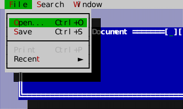
The compiled scene below is the source of this figure.
bar->activate();  // F10 does this for the reader; Down drops the menu
stage.app().dispatch(KeyEvent{KeyChord{Key::Down, Modifier::None, ""}});
MenuBarItem
Header: include/cvision/widgets/menu.hpp. Top-level label plus its MenuItem
rows, normally constructed before making a MenuBar.
MenuBar
Header: include/cvision/widgets/menu.hpp. Dock it at the Desktop top. F10
activates the standard menu command, mnemonics enter menus, and Escape closes
one level at a time — a submenu, then the dropdown, leaving the walk on its
title — until a last Escape on the bar itself restores the preceding focus.
A press outside every open menu ends the walk at once: the bar deactivates and
the preceding focus comes back.
Its mnemonic letters use the shared ckv.hotkey accent. A disabled row draws
its mnemonic like the rest of its label, in the disabled style, since it does
not answer that key (D-076).
Focus stays on the bar for as long as any of its menus is open, so the bar is
what delivers keys to them — always to the innermost one, which is where the
reader's highlight is. Left and Right walk the top-level menus, except where a
DropdownMenu has a submenu to enter or leave.
The Hello tutorial shows it open.

The compiled scene below is the source of this figure.
auto* bar = stage.desktop().dock_top(std::make_unique<widgets::MenuBar>(demo_menus(ids)));
bar->on_highlight_changed = [](const widgets::MenuHighlight& highlight) {
    (void)highlight;  // e.g. mirror the help context into a status line
};
A bar too narrow for its titles never clips one. It draws the titles that fit
in full and ends them with the overflow title », whose dropdown lists the
hidden titles, each as a submenu holding that menu's rows
(visible_menu_count(), overflowing()). The overflow title is one more stop
on the walk — Left, Right, Home and End reach it and wrap past it — a press on
it opens the list, and a hidden menu's mnemonic, Alt+letter or the bare letter
while the bar is walked, opens the list with that menu already entered. A
resize that shows or hides the title of an open menu moves the menu with it,
and the reader stays inside it.
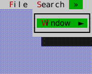
The compiled scene below is the source of this figure: a twenty-column terminal, where File and Search fit and Window does not.
bar->activate();  // F10 does this for the reader
// The overflow title is the walk's last stop; Down lists what is behind it.
stage.app().dispatch(KeyEvent{KeyChord{Key::End, Modifier::None, ""}});
stage.app().dispatch(KeyEvent{KeyChord{Key::Down, Modifier::None, ""}});
MenuBarAccessory
Header: include/cvision/widgets/menu.hpp. What a view implements to become a
participant in the menu bar rather than something merely parked on it. A bar
with a trailing view — a clock at the right end, say — walks onto it with the
arrow keys and activates it with Enter or Space, and the accessory is told when
it is the highlighted slot so it can wear the bar's active colours like any
menu title. MenuBar::set_trailing_view<T>() installs one and hands back the
typed pointer; a trailing view that does not implement the interface is still
laid out and drawn, it simply cannot be reached from the keyboard.
MemoPosition
Header: include/cvision/widgets/memo.hpp. A line/grapheme position value for
Memo cursor and selection APIs.
MessageBoxDescriptor
Header: include/cvision/widgets/message_box.hpp. A kind/title/message/button
set record for present_modal_message_box; use a completion handler for its typed
result. It may additionally carry immutable raster artwork, requested cell
dimensions, a minimum content width, and explicit graphic/text/button
alignment for a deliberate identity presentation while ordinary alerts retain
their compact composition.
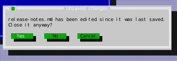
The compiled scene below is the source of this figure.
widgets::MessageBoxDescriptor descriptor{
    widgets::MessageBoxKind::Confirm, "Unsaved changes",
    "release-notes.md has been edited since it was last saved.\n"
    "Close it anyway?",
    widgets::MessageBoxButtons::YesNoCancel};

widgets::MessageBoxPresentation box =
    widgets::present_modal_message_box(stage.app(), stage.desktop(), stage.roles(), descriptor);
box.set_completion_handler([](widgets::MessageBoxResult result) {
    (void)result;  // Yes, No, or Cancel -- arrives after the box detaches
});
CheckGroup
Header: include/cvision/widgets/option_group.hpp. Use multiple independent
choices. Arrows select a row and Space toggles it; optionally enable tri-state
values as shown in Forms. Its visual contract is square [ ]/[X] markers.
set_group_label() gives the group an owned caption one row above the choices;
the caption changes from its normal label colour to the focused-option
foreground while the group owns keyboard focus. The caption is the group's
label in the sense a Label is a field's: it may carry a &-marked mnemonic,
and Alt with that letter, pressed anywhere in the group's window, gives the
group the focus. set_columns() lets the choices flow into columns, row-major,
each column as wide as the widest choice in it, so one row packs its choices
and several rows align as a table; Left and Right step through the choices in
order, Up and Down move within a column, and an arrow that would not move the
cursor — Up on a single row, any arrow on a lone box — walks the window's
controls instead, as D-065 has every dialog do.
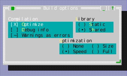
The compiled scene below is the source of this figure.
auto* flags = content.make<widgets::CheckGroup>(
    std::vector<std::string>{"&Optimize", "&Debug info", "Warnings as errors"});
flags->set_group_label("Compilation");
flags->set_bounds(Rect{1, 1, 24, 4});
flags->set_checked(0, true);
flags->set_tristate(true);  // admits the third, Mixed state
flags->set_check_state(2, widgets::CheckState::Mixed);
flags->on_changed = [](std::size_t index, bool value) { (void)index; (void)value; };
CheckGroup and RadioGroup offer OptionPresentation::Classic, BoxedRows and
Buttons. BoxedRows uses three rows per choice. Buttons uses a padded one-row
choice with check, mixed or radio indicators instead of decorative brackets.
Selected captions are bold, while keyboard focus adds underline independently.
Alternate-style gaps and group captions are inert. All variants retain columns,
tristate and callbacks. Disabled input and key releases cannot change state.
Display variants
All examples below use the same Classic color scheme. These are layout and containment choices configured per widget, rather than color variants.
Classic
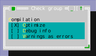
Boxed rows
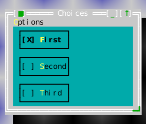
Buttons
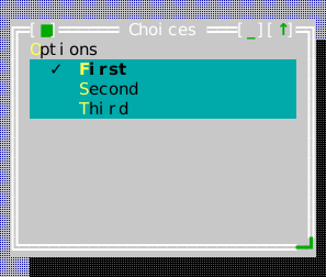
PopupList
Header: include/cvision/widgets/popup_list.hpp. The list a control drops
when its choices are data rather than commands. A
DropdownMenu is the right popup for things to do — its
items carry commands, mnemonics, check marks and submenus — while a list of
months, fonts or files is things to be, and there may be more of them than
fit on the screen. So this is a ListView in a popup: the frame,
the colours and the dismissal rules are the menu's, the scrolling and
selection are the list's, and neither reimplements half of the other.
show_popup_list() hangs one under an anchor rectangle — below it, or above
it where there is no room below rather than clamped down over the control that
opened it — takes the mouse and the keys while it is up, and restores focus
when it closes. It casts the standard popup shadow, as a dropdown menu does. Enter or a single press on a row chooses; Escape or a press
outside dismisses. One of the two callbacks runs, once.

The compiled scene below is the source of this figure.
auto popup = std::make_unique<widgets::PopupList>(
    std::vector<std::string>{"UTF-8", "UTF-16LE", "Latin-1", "Shift-JIS"},
    std::optional<std::size_t>{0});
popup->set_bounds(Rect{24, 6, 16, 6});
popup->on_choose = [](std::size_t index) { (void)index; /* apply the encoding */ };
popup->on_dismiss = [] { /* nothing was chosen */ };
widgets::PopupList* list = stage.desktop().add<widgets::PopupList>(std::move(popup));
stage.app().set_focus(&list->list());  // the inner ListView is the focusable part
RadioGroup
Header: include/cvision/widgets/option_group.hpp. Use exactly one choice.
Arrows and mnemonics change its selected index. Its visual contract is rounded
( )/(U+2022) markers. set_group_label() gives the group an owned caption
one row above the choices; the caption changes from its normal label colour to
the focused-option foreground while the group owns keyboard focus, and its
&-marked letter reaches the group from anywhere in its window, as a
CheckGroup's does. set_columns() lays the choices out in
columns the same way: the figure's second group asks one question of four
short answers in two columns rather than four rows, which is how a form that
asks the same short question several times over stays on one screen. Use
set_column_width() only for a measured form column; it clips long labels at
that specified edge rather than changing the control's interaction model.
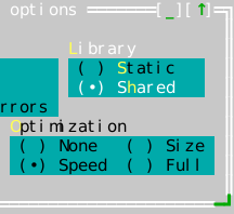
The compiled scene below is the source of this figure.
auto* target = content.make<widgets::RadioGroup>(
    std::vector<std::string>{"&Static", "S&hared"});
target->set_group_label("&Library");  // Alt+L focuses the group
target->set_bounds(Rect{26, 1, 14, 3});
target->set_selected(1);
target->on_changed = [](int index) { (void)index; };

auto* level = content.make<widgets::RadioGroup>(
    std::vector<std::string>{"None", "Size", "Speed", "Full"});
level->set_group_label("&Optimization");
level->set_columns(2);  // two choices per row, each column as wide as its widest
level->set_bounds(Rect{20, 5, 21, 3});
level->set_selected(2);
CheckGroup and RadioGroup offer OptionPresentation::Classic, BoxedRows and
Buttons. BoxedRows uses three rows per choice. Buttons uses a padded one-row
choice with check, mixed or radio indicators instead of decorative brackets.
Selected captions are bold, while keyboard focus adds underline independently.
Alternate-style gaps and group captions are inert. All variants retain columns,
tristate and callbacks. Disabled input and key releases cannot change state.
Display variants
All examples below use the same Classic color scheme. These are layout and containment choices configured per widget, rather than color variants.
Classic
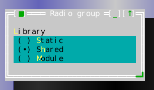
Boxed rows
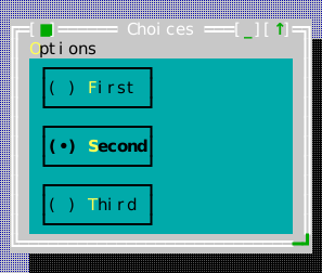
Buttons
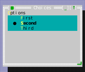
Progress
Header: include/cvision/widgets/progress.hpp. Use a determinate fraction
with an optional label; application work updates it through set_fraction.
set_presentation() selects ProgressPresentation::Solid (the default colored
span), Block (visible filled/shaded glyphs), Segmented (two-column units
with a glyph and a gap), or Smooth (Unicode eighth-cell coverage). All use one row. set_show_percentage(true) adds a
right-aligned percentage beside a determinate meter when at least six columns
are available; narrower and indeterminate meters omit it. The label stays
centered on the meter. Dedicated ckv.progress.track/fill/label/disabled roles
permit independent styling. Disabled meters retain their fraction and geometry,
with dimmed foreground. Animation accepts explicit set_pulse values or a ProgressController binding.
set_activity_style() selects Sweep, Bounce or Pulse; set_glyphs() explicitly
selects Unicode or ASCII, and set_motion(Static) keeps a stable activity marker.
See advanced progress for scheduling and task progress.
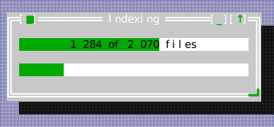
The compiled scene below is the source of this figure.
auto* bar = content.make<widgets::Progress>();
bar->set_bounds(Rect{1, 1, 36, 1});
bar->set_fraction(0.62);
bar->set_label("1 284 of 2 070 files");

auto* scanning = content.make<widgets::Progress>();
scanning->set_bounds(Rect{1, 3, 36, 1});
scanning->set_indeterminate(true);  // no fraction is known yet
scanning->set_pulse(7);             // the host advances this per tick
Display variants
All examples below use the same Classic color scheme. These are layout and containment choices configured per widget, rather than color variants.
Solid
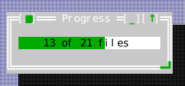
Block
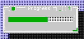
Segmented
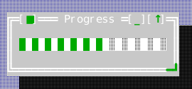
Percentage readout
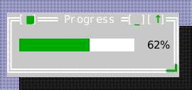
Smooth
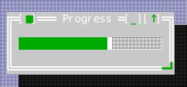
The fractional-cell steps:
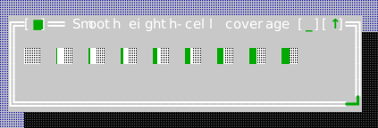
ActivityIndicator
Header: include/cvision/widgets/progress_tasks.hpp.
See advanced progress for ownership, scheduling and customization.
auto* indicator = body.make<widgets::ActivityIndicator>();
indicator->set_bounds(Rect{2, 1, 12, 1});
indicator->set_presentation(widgets::ActivityPresentation::Braille);
indicator->set_phase(3); // explicit replay phase; controller binding animates it
Display variants
Normal
Dots
Ascii
Custom
Static
Queued
Paused
Completed
Failed
Cancelled
Phases
ProgressView
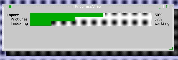
Header: include/cvision/widgets/progress_tasks.hpp.
See advanced progress for ownership, scheduling and customization.
display = make<widgets::ProgressView>(model);
main = model.add_task({.title = "Import", .total = 5, .unit = "stages"});
pictures = model.add_task({.title = "Pictures", .parent = main,
                           .total = 200, .unit = "files", .weight = 3});
index = model.add_task({.title = "Indexing", .parent = main});
model.start(main);
model.start(pictures);
model.start(index);
model.set_completed(main, 3);
model.set_time(1'000'000'000);
model.set_completed(pictures, 74);
model.set_message(pictures, "holiday-2026.jpg");
model.set_message(index, "Discovering files…");
Display variants
Normal
Detailed
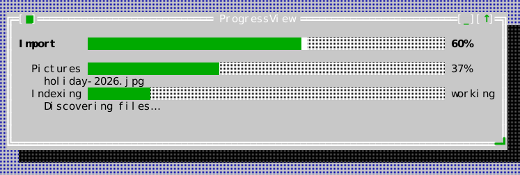
Solid
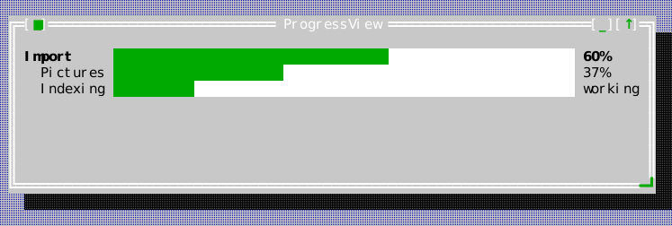
Block
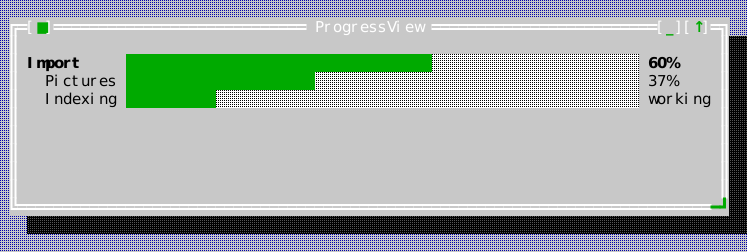
Segmented
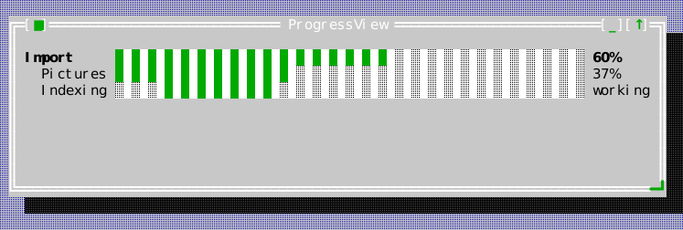
Bounce
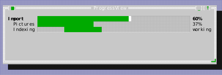
Pulse
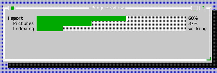
Ascii
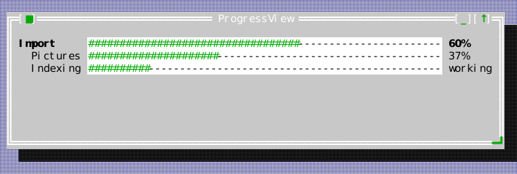
Static
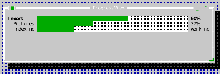
Columns
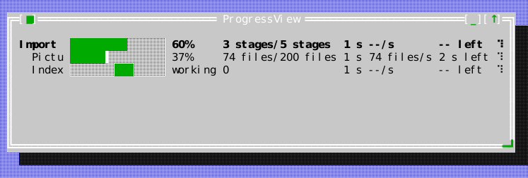
Weighted
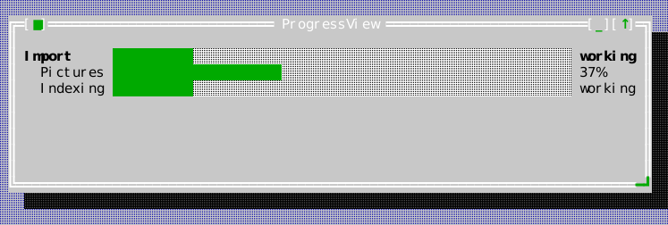
Failed
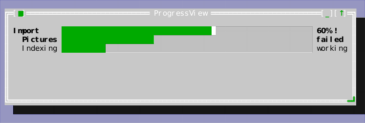
Paused
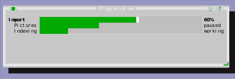
Completed
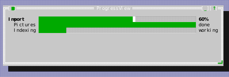
Collapsed
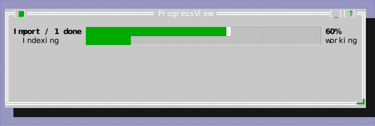
Narrow
ProgressTaskOptions
Owned task title, parent, optional total, unit, weight and aggregation policy. See advanced progress for the public contract.
ProgressTask
Read-only task snapshot; update through the model so observers stay coherent. See advanced progress for the public contract.
ProgressMetrics
Derived exact fraction, known lower bound, pause-aware elapsed time, rate, ETA and child exceptions. See advanced progress for the public contract.
ProgressSubscription
Move-only scoped observer connection that is safe after model destruction. See advanced progress for the public contract.
ProgressModel
Instance-owned task hierarchy with explicit state and monotonic time. See advanced progress for the public contract.
ProgressColumns
Independent percentage, counts, elapsed, rate, ETA and spinner flags. See advanced progress for the public contract.
ProgressController
One shared one-shot timer for bound progress displays and indicators. See advanced progress for the public contract.
ProgressMailbox
Bounded, coalescing worker-to-UI progress delivery through Application::post. See advanced progress for the public contract.
ScrollViewport
Header: include/cvision/widgets/scroll_viewport.hpp. Use to expose a larger
child view through a clipped scrollable region. Pair with Scrollbar when a
visible position control helps. set_scrollbars_always_visible(true) retains
both conventional tracks for document views whose content may grow. Both
appear in the navigation capture above.
set_vertical_scrollbar_policy and set_horizontal_scrollbar_policy set the
two axes separately, for a surface that wants one bar's rule and not the
other's. ScrollbarPolicy::Hidden says more than "draw no bar": that axis
does not scroll at all, and the content is held to the visible extent rather
than to its own larger preferred one — so nothing can end up off screen along
an axis offering neither a bar nor a key to bring it back. A dialog uses
exactly that pairing: Auto vertically, Hidden horizontally.
ensure_visible(view) scrolls by the least amount that brings a descendant
fully into sight, and answers whether it moved anything. Whoever moves focus
into a scrolled surface should call it: a control that takes focus while
scrolled out of sight leaves the terminal cursor blinking where the reader
cannot see it. can_scroll_vertically()/can_scroll_horizontally() answer
whether there is anywhere to go — and a viewport with nowhere to go leaves the
arrow keys and the wheel alone rather than consuming them to move by nothing.
Whether the viewport takes the focus is the caller's decision, made at
construction: ScrollViewport(ui::FocusPolicy::TabStop) for static content
that nothing inside can focus — prose, a report, a picture — so that a reader
without a pointer can still reach it and scroll it; the default None for a
form or list whose own controls take the focus and pull it into view.
The mouse wheel reaches the viewport from anywhere over its content, because Application walks an unhandled wheel event up the ancestors of whatever it hit. A content widget that consumes the wheel for its own scrolling keeps it, which is the right answer — the innermost scrollable surface under the pointer is the one that should move — but it does mean an OUTER viewport never sees a wheel an inner one has taken.
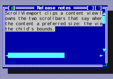
The compiled scene below is the source of this figure.
auto* viewport = content.make<widgets::ScrollViewport>();
viewport->set_bounds(Rect{0, 0, 38, 9});

auto page = std::make_unique<ui::View>();
page->set_preferred_size(Size{60, 30});  // the world, larger than the hole
auto* body = page->make<widgets::StaticText>(
    "ScrollViewport clips a content view larger than itself and owns the two "
    "scrollbars that say where in it you are. Give the content a preferred "
    "size: the viewport reads that, not the child's bounds.");
body->set_bounds(Rect{0, 0, 58, 12});
viewport->set_content(std::move(page));
viewport->set_scroll(0, 0);
viewport->set_scrollbars_always_visible(true);
Scrollbar
Header: include/cvision/widgets/scrollbar.hpp. Use for an explicit vertical
or horizontal scroll position. Arrow/page keys and pointer interaction adjust
its model; orientation comes from Orientation. The built-in presentation uses
the CP437-style U+25B2/U+25BC or U+25C4/U+25BA arrows, a page area of blank
cells marked by the track colour alone, and a proportional thumb drawn at
half-cell resolution: U+2588 full blocks, with a U+2580/U+2584 (vertical) or
U+258C/U+2590 (horizontal) half block where the thumb covers only half a cell.
A shaded page area would meet the empty half of such a cell at a visible seam,
so colour alone marks it. The active scheme owns the colours.
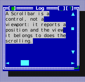
The compiled scene below is the source of this figure.
auto* bar = content.make<widgets::Scrollbar>(widgets::Orientation::Vertical);
bar->set_bounds(Rect{24, 0, 1, 8});
bar->set_range(/*content_size=*/240, /*viewport_size=*/8);
bar->set_position(96);
bar->set_policy(widgets::ScrollbarPolicy::Auto);
bar->on_position_changed = [](int position) { (void)position; };

auto* ruler = content.make<widgets::Scrollbar>(widgets::Orientation::Horizontal);
ruler->set_bounds(Rect{0, 9, 25, 1});
ruler->set_range(200, 25);
ruler->set_position(40);
Splitter
SplitterPresentation::Line remains the default one-cell divider.
CentralGrip adds three centered grip marks; Gutter reserves three cells for a
line and grip between the panes. set_presentation() preserves the requested
anchored pane extent. divider_bounds() is the clipped local rectangle used for
paint, drag and resize pointers. Gutter drags retain their initial grab offset.
Style, resize, pane visibility and external position changes cancel dragging.
Hover uses ckv.splitter.hovered; focus/drag emphasis wins over hover. Disabled
splitters refuse adjustment, and key releases do not move the divider.
Header: include/cvision/widgets/splitter.hpp. Use exactly two adjacent panes
with user-controlled division. Focus it and use its directional keys, or drag
the divider. Layout guide and File Browser show it.
The first pane keeps its size when the splitter resizes; set_resize_anchor
gives that to the second instead, which is what a side panel on the far edge
wants. set_anchored_extent asks for the anchored pane's size — kept as asked
across resizes, and honoured even when set before the splitter has a size, so a
remembered width restores exactly — and on_split_moved reports the reader
moving the divider, which is when to remember it. A pane set invisible takes no
room: the other fills the splitter and no divider remains until it shows again.
Two splitters, one inside the other with opposite anchors, make a document with
a panel on each side.
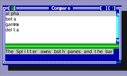
The compiled scene below is the source of this figure.
auto left = std::make_unique<widgets::ListView>();
left->set_items({"alpha", "beta", "gamma", "delta"});
auto right = std::make_unique<widgets::StaticText>(
    "The Splitter owns both panes and the bar between them. Drag the bar, or "
    "focus it and use the arrow keys.");

auto* splitter = content.make<widgets::Splitter>(Rect{0, 0, 42, 8}, std::move(left),
                                                 std::move(right),
                                                 widgets::Orientation::Vertical);
splitter->set_split_position(16);
Display variants
All examples below use the same Classic color scheme. These are layout and containment choices configured per widget, rather than color variants.
Line
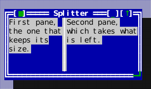
Central grip
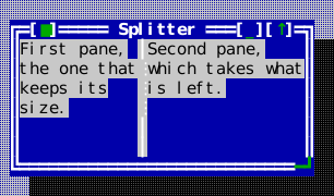
Gutter
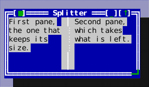
StandardStrings
Header: include/cvision/widgets/standard_strings.hpp. Application-local
standard dialog wording; pass it to factories instead of installing global
localization state.
StaticText
Header: include/cvision/widgets/static_text.hpp. Use passive, wrapping text.
It is not editable/focusable like Memo or TextView links.
A paragraph asks to be kProseMeasureCells wide at most, whatever its
unwrapped length, and wraps into whatever width it is actually given. That
request is what decides the width of a container that sizes itself to its text
— a message box, or a Column asked for its preferred width — so prose in one
opens at a width it can be read at instead of at the width of the terminal.
Text marked preformatted with set_preformatted asks for every column it was
written with instead: it cannot be reflowed, so a narrower view would clip it.
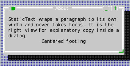
The compiled scene below is the source of this figure.
auto* body = content.make<widgets::StaticText>(
    "StaticText wraps a paragraph to its own width and never takes focus. "
    "It is the right view for explanatory copy inside a dialog.");
body->set_bounds(Rect{1, 1, 40, 4});

auto* footer = content.make<widgets::StaticText>("Centered footing");
footer->set_alignment(ui::Alignment::Center);
footer->set_bounds(Rect{1, 5, 40, 1});
StatusLineItem
Header: include/cvision/widgets/status_line.hpp. A command presentation or
short status surface entry used by StatusLine.
StatusLine
Header: include/cvision/widgets/status_line.hpp. Dock it at Desktop bottom
for command hints and contextual help. Its command item executes the same
registry action as a menu item. StatusLinePresentation::Plain is the default.
Grouped adds a single divider between logical groups marked with
StatusLineItem::group_break_before; dropping low-priority items preserves group
boundaries without leading or trailing separators. Chords always precede their
labels without brackets. Gaps, dividers and the separate contextual message
region are inert. Presentation changes, resizing and focus-context changes
cancel a held command so release cannot execute a different item. The registered key chord automatically uses
the same ckv.hotkey accent as menu mnemonics. set_context_items() gives a
command context (View::set_command_context) an item set of its own, shown
instead of the ordinary items while focus is inside that context — an editor's
keys while the editor has the focus, a list's while the list does. The hint
is resolved through the focused view's nearest help-context key, and with
nothing focused — an empty desktop — through the root's (D-069): an
application that gives Application::root() a key has a hint before its
first window opens. Provider results are prepared when the resolved help key or
command registry revision changes; call refresh_hint() if the host changes the
mapping for the same key. Prepared captions, geometry and hint text are reused
for steady paint and hit testing without allocations.

Optional grouping adds separators only between related command sets:

The compiled scene below is the source of this figure.
auto* status = stage.desktop().dock_bottom(std::make_unique<widgets::StatusLine>());
// Each item names a command; the status line composes "{chord} {title}"
// from the registry, so the hint always states the binding in force.
status->set_items({
    widgets::StatusLineItem{widgets::CommandPresentation{stage.app().commands().standard().help}},
    widgets::StatusLineItem{widgets::CommandPresentation{ids.save}},
    widgets::StatusLineItem{widgets::CommandPresentation{ids.print}},
    widgets::StatusLineItem{widgets::CommandPresentation{stage.app().commands().standard().quit}},
});
status->set_transient_hint("Saved package.json (1 284 bytes)");
Display variants
All examples below use the same Classic color scheme. These are layout and containment choices configured per widget, rather than color variants.
Plain

Grouped

TabControl
Header: include/cvision/widgets/tab_control.hpp. Use mutually exclusive
pages within one window. One control supports three presentations through
set_presentation(TabPresentation::Underlined/Framed/Compact) (D-117):
| Presentation | Header and page geometry | Selected tab |
|---|---|---|
Underlined (default) | Two header rows; full-width page below | Selected background and a heavy baseline segment |
Framed | Three header rows; page inset one column, excluding the bottom frame | Tab cap opens into the single-line page frame |
Compact | One header row; full-width page below | Color and bold weight mark selection |
The selected label is underlined while the strip holds keyboard focus. Selection remains visible when focus moves into the page. Changing presentation on an attached control keeps its pages, selection and focus, updates page bounds and notifies its parent's layout of changed size hints. Tiny bounds clip the chosen geometry without switching presentation; page extents never go negative.
Left/Right and Alt with a caption's mnemonic change the active page; Tab and
Shift+Tab remain focus traversal. Clicks use the same geometry as painting:
a caption's header rectangle selects its page; page content is not a tab target.
When captions overflow, both edge columns are reserved, and ◂/▸ appear where
captions are hidden. Clicking an arrow scrolls one caption, moving selection to
the nearest shown caption only if it would otherwise leave the strip (D-100).
Switching pages scrolls just far enough to show the selected caption; resizing
settles the strip back toward the start when room allows. Oversized captions
use complete-grapheme ellipsis. Disabled controls retain selection geometry
and background, with disabled foreground and no focus or mnemonic accent.
Underlined:
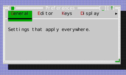
Framed:
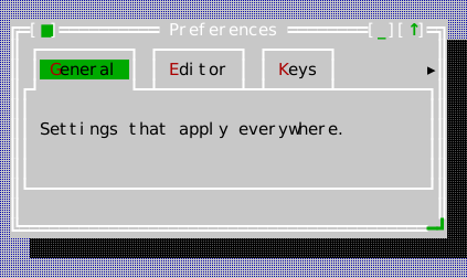
Compact:
The compiled scene below is the source of this figure.
auto* tabs = content.make<widgets::TabControl>();
tabs->set_bounds(Rect{0, 0, 42, 8});

auto general = std::make_unique<ui::View>();
general->make<widgets::StaticText>("Settings that apply everywhere.")
    ->set_bounds(Rect{1, 1, 36, 2});
tabs->add_tab("&General", std::move(general));

auto editor = std::make_unique<ui::View>();
editor->make<widgets::StaticText>("Editor-only settings.")->set_bounds(Rect{1, 1, 36, 2});
tabs->add_tab("&Editor", std::move(editor));

// More captions than the strip holds: it scrolls to keep the active
// one shown, and marks the side that hides the others.
for (const char* label : {"&Keys", "&Display", "&Advanced", "&Plugins"})
    tabs->add_tab(label, std::make_unique<ui::View>());
tabs->set_active_index(0);
TableCell
Header: include/cvision/widgets/table.hpp. A typed value, independent display
text, optional style, and editability flag supplied by a TableModel.
TableCellRef
Header: include/cvision/widgets/table.hpp. Stable row identity plus column
position used for selection, editing, sorting callbacks, and model commits.
TableEditResult
Header: include/cvision/widgets/table.hpp. The provider's explicit accept or
reject result for an edit, including a diagnostic retained by Table on failure.
TableModel
Header: include/cvision/widgets/table.hpp. A caller-owned synchronous
visible-slice provider for typed Table cells, ordering requests, and validated
commits. See Data views.
TableColumn
Header: include/cvision/widgets/table.hpp. Defines a Table header and sizing
constraints.
Table
set_banded_rows(true) uses ckv.table.banded on alternate display rows.
set_column_dividers(true) adds thin rules with ckv.table.divider in existing
column gaps. Both options default to false and can be combined. Cell widths,
sort/resize boundaries, cursor identity and editor positions remain unchanged.
Explicit cell styles and selection/editing emphasis supersede the row surface.
Header: include/cvision/widgets/table.hpp. Use aligned sortable typed
rows/columns. Arrow keys navigate; F2, Enter, or typing begins an editable
cell's provider-validated edit. A press on a cell moves the cursor there, and
the wheel scrolls the body without moving it. Use a TableModel for dynamic or large data.
A cell that styles itself — a provider cell's style, or the materialized
style hook — keeps its colouring under the cursor, which is drawn over it the
way CellGrid draws its cursor over a coloured cell (D-067).
| Table with typed columns | Table with an active cell editor |
|---|---|
 |  |
The compiled scene below is the source of this figure.
table->set_columns({
    widgets::TableColumn{"Suite", 22, 8, widgets::TableCellType::Text, false},
    widgets::TableColumn{"Cases", 7, 4, widgets::TableCellType::Integer, false},
    widgets::TableColumn{"Owner", 12, 5, widgets::TableCellType::Text, true},
});
table->set_rows({
    {"test_application", "148", "core"},
    {"test_editor", "96", "editor"},
    {"test_frame_svg", "12", "docgen"},
    {"test_table", "54", "widgets"},
});
// With set_rows() and no TableModel the built-in order is a plain
// text comparison of that column; a model decides its own order in
// request_sort() instead.
table->sort_by(0, /*ascending=*/true);
table->set_selected_cell(widgets::TableCellRef{0, 2});
table->on_edit_committed = [](widgets::TableCellRef cell,
                              const widgets::TableEditResult& result) {
    (void)cell;
    (void)result;
};
Display variants
All examples below use the same Classic color scheme. These are layout and containment choices configured per widget, rather than color variants.
Plain
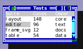
Banded
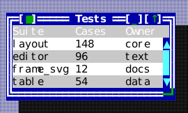
Divided columns
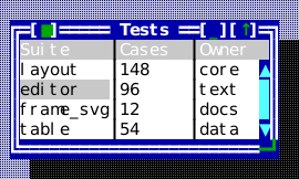
Banded and divided
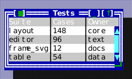
GridPosition
Header: include/cvision/widgets/cell_grid.hpp. A row and a column in a
CellGridModel's own index space — where the cursor is, where a press landed.
GridRange
Header: include/cvision/widgets/cell_grid.hpp. An inclusive rectangle of
grid positions with its corners ordered: a selection, or a merged span.
GridCellStyle
Header: include/cvision/widgets/cell_grid.hpp. What one cell changes about
the grid's cell style — a foreground, a background, the attributes, the
underline shape — with every member it leaves empty kept as the theme's.
GridCell
Header: include/cvision/widgets/cell_grid.hpp. One cell as a CellGridModel
answers it: its text, what it changes about the grid's cell style
(GridCellStyle), and where the text sits in the cell.
GridFrame
Header: include/cvision/widgets/cell_grid.hpp. The rows and columns a
CellGrid shows, each frozen band first, and the merged spans that reach into
them.
CellGridModel
Header: include/cvision/widgets/cell_grid.hpp. The caller-owned provider of
a CellGrid. Unlike the list, tree and table providers it also owns the cursor,
the selection and the scroll origin, and is asked to move them (D-067); see
Data views.
MaterializedCellGridModel
Header: include/cvision/widgets/cell_grid.hpp. A CellGridModel over a table
of values held in the model, with the generic rules: the cursor clamps to the
table, a page is the body's height, a jump reaches the table's edge.
CellGrid
Header: include/cvision/widgets/cell_grid.hpp. Use for a surface of cells: a
worksheet, a query result, a matrix. Arrows move the cursor, Shift extends the
selection, Ctrl jumps, Home and End reach the row's ends and, with Ctrl, the
grid's; Enter or F2 activate the cursor cell, a printable key starts
type-ahead, and Delete asks to clear. A press places the cursor, a drag
extends, a double click activates, the wheel scrolls the body. The provider
owns the cursor and is asked to move it.
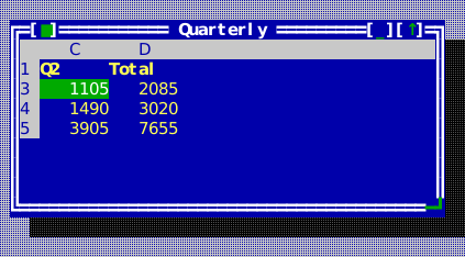
The compiled scene below is the source of this figure.
sheet.set_cells({
    {"Region", "Q1", "Q2", "Total"},
    {"North", "1240", "1310", "2550"},
    {"South", "980", "1105", "2085"},
    {"West", "1530", "1490", "3020"},
    {"Sum", "3750", "3905", "7655"},
});
sheet.set_column_widths({8, 7, 7, 7});
sheet.set_frozen(1, 0);  // the title row stays while the body scrolls
for (widgets::GridIndex column = 0; column < sheet.column_count(); ++column) {
    widgets::GridCell title = sheet.cell_at({0, column});
    title.style.attributes = Attr::Bold;
    sheet.set_cell({0, column}, title);
}
for (widgets::GridIndex row = 1; row < sheet.row_count(); ++row)
    for (widgets::GridIndex column = 1; column < sheet.column_count(); ++column) {
        widgets::GridCell figure = sheet.cell_at({row, column});
        figure.alignment = widgets::CellAlignment::End;  // figures end at the right edge
        sheet.set_cell({row, column}, figure);
    }
sheet.place_cursor({2, 1}, false);
sheet.navigate(widgets::GridMove::Right, true);  // Shift+Right: a two-cell selection
grid->set_model(sheet);
grid->on_activate = [] { /* edit the cursor cell */ };
grid->on_type_ahead = [](const std::string& text) { (void)text; /* start editing with it */ };
TerminalView
Header: include/cvision/widgets/terminal_view.hpp. Hosts one explicitly
launched TerminalSubsession in a normal view tree. It renders the private
child snapshot, forwards the child input modes it requests, and keeps parent
focus under the application's control; see Embedded terminal.
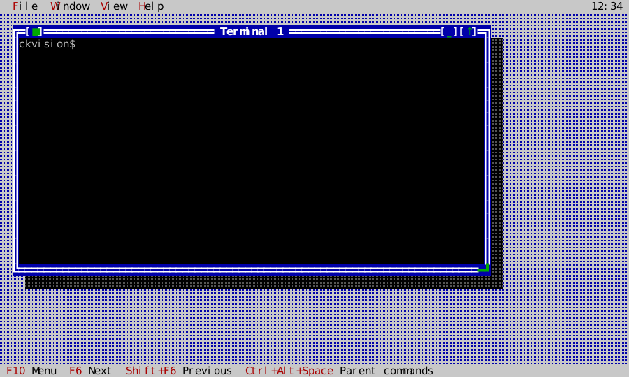
The compiled scene below is the source of this figure.
auto window = std::make_unique<widgets::Window>(std::move(title));
window->set_bounds(Rect{2, 2, 76, 20});

term::TerminalSubsession& session = services_.make_subsession
    ? app_.adopt_terminal_subsession(services_.make_subsession(std::move(launch)))
    : app_.launch_terminal_subsession(std::move(launch));
auto view = std::make_unique<widgets::TerminalView>(session);
widgets::TerminalView* const terminal_view = view.get();
view->set_bounds(window->content_rect());
view->set_parent_escape_command(parent_commands_command_);
view->on_selection_copy = [this](std::string text) { app_.set_clipboard_text(std::move(text)); };
window->set_content(std::move(view));
Terminal report dialog
Header: include/cvision/widgets/terminal_report_dialog.hpp. The standard
typed dialog showing ckv::term::capability_report() — what the terminal
reported and what ckVision concluded from it — together with the
application's mouse-dispatch diagnostics; its Copy button exports the
plain-text form for a bug report. Desktop installs it behind the standard
terminal_report command, so an application need only place that command in
a menu; an application whose terminal can count decoded SGR mouse reports (a
POSIX host) presents the dialog itself through
present_modal_terminal_report_dialog and passes
TerminalReportDialogOptions::mouse_reports_decoded.
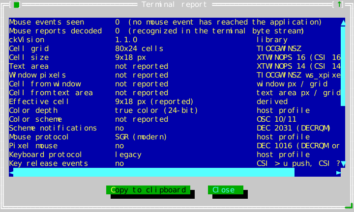
The compiled scene below is the source of this figure.
widgets::TerminalReportDialogOptions options;
options.mouse_reports_decoded = [] { return std::size_t{0}; };

widgets::TerminalReportDialogPresentation report = widgets::present_modal_terminal_report_dialog(
    stage.desktop(), stage.app(), stage.roles(), options);
report.set_completion_handler([](widgets::TerminalReportDialogResult result) { (void)result; });
TerminalReportDialogOptions
Header: include/cvision/widgets/terminal_report_dialog.hpp. What the
report cannot observe through the Application: mouse_reports_decoded
supplies the count of SGR mouse reports the terminal layer recognized in
the byte stream, shown beside the events dispatch actually delivered.
Left empty, the report omits that line — a headless or mirrored terminal
has no byte stream of its own to count.
Date dialog
Header: include/cvision/widgets/date_time_dialog.hpp. The standard modal date
dialog: a month picker and an editable year field over a CalendarView, OK and
Cancel. present_modal_date_dialog returns a DateDialogPresentation that completes
once, after the window has gone. Every word it shows comes from the options'
DateTimeLabels table and from StandardStrings
(select_date_title, ok, cancel); nothing is read from a clock or a
locale. A typed year the calendar cannot draw is refused, and OK is vetoed with
its reason standing under the calendar until it is corrected; see
Dialogs.
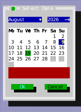
The compiled scene below is the source of this figure.
widgets::DateDialogOptions options;
options.initial = widgets::DateValue{2026, 8, 19};
options.today = widgets::DateValue{2026, 8, 9};  // the host's today, never a clock's
options.maximum = widgets::DateValue{2026, 8, 28};
options.labels.weekday_names = {"Mo", "Tu", "We", "Th", "Fr", "Sa", "Su"};  // any language's
widgets::DateDialogPresentation due =
    widgets::present_modal_date_dialog(stage.app(), stage.desktop(), stage.roles(), std::move(options));
due.set_completion_handler([](widgets::DateDialogResult result) {
    if (result.accepted) (void)result.date;
});
DateDialogOptions
Header: include/cvision/widgets/date_time_dialog.hpp. What the date dialog
opens on and offers: the initial day, the day marked as today (the host's,
or none), the selectable range (minimum, maximum, and a disabled
predicate, as CalendarView takes them), the first weekday, the ISO week column,
and the labels table.
DateDialogResult
Header: include/cvision/widgets/date_time_dialog.hpp. How the date dialog
ended: accepted with the chosen date, or not accepted — Cancel, Escape, the
close control, an external detach or a quit — when date means nothing.
Time dialog
Header: include/cvision/widgets/date_time_dialog.hpp. The standard modal time
dialog: a TimePicker over OK and Cancel, presented by present_modal_time_dialog,
which returns a TimeDialogPresentation. Its title is StandardStrings'
select_time_title, and on the twelve-hour face the meridiem words are the
options' labels.
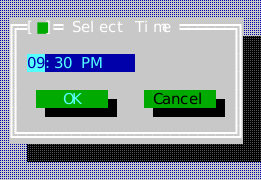
The compiled scene below is the source of this figure.
widgets::TimeDialogOptions options;
options.initial = widgets::TimeValue{21, 30, 0};
options.show_seconds = false;
options.hour_format = widgets::HourFormat::TwelveHour;
options.labels.am = "AM";  // the host's words for the two halves of the day
options.labels.pm = "PM";
widgets::TimeDialogPresentation alarm =
    widgets::present_modal_time_dialog(stage.app(), stage.desktop(), stage.roles(), std::move(options));
alarm.set_completion_handler([](widgets::TimeDialogResult result) {
    if (result.accepted) (void)result.time;
});
TimeDialogOptions
Header: include/cvision/widgets/date_time_dialog.hpp. The time the dialog
opens on, whether the seconds field is shown, the HourFormat, and the
labels table its meridiem words come from.
TimeDialogResult
Header: include/cvision/widgets/date_time_dialog.hpp. How the time dialog
ended: accepted with the time set — its seconds zero when the seconds field
was not shown — or not accepted.
TextSpan
Header: include/cvision/widgets/text_view.hpp. Styled/link-capable fragment
used by TextView.
WrapMode
Where a line is allowed to break, shared by every scrolling text surface —
TextView, Memo and TextEditor all take the same three choices, so a
reader meets one behaviour rather than three.
WrapMode::None— one display row per logical line, however long, with a horizontal scrollbar reaching the rest. Preformatted text (a table, a diagram, source, a log) means what it means only at its own line breaks. This is the default forTextViewandTextEditor.WrapMode::Word— break between words, keeping each whole. What prose wants, and the default forMemoand for the help viewer. A word wider than the row is not split: it takes a row of its own and overflows, which is what brings the horizontal bar out rather than telling the reader a path is shorter than it is.WrapMode::Character— break exactly at the edge, mid-word where the edge falls there. For content with no word structure to respect: a hex dump, one unbroken identifier, a script that does not space its words.
editor->set_wrap_mode(widgets::WrapMode::Word);
memo->set_wrap_mode(widgets::WrapMode::Character);
WrapOptions
The width a row may use, the WrapMode, and continuation_reserve — cells
held back on wrapped rows for a continuation marker the caller draws.
wrap_graphemes indexes by grapheme cluster, wrap_text by byte offset; both
respect cluster boundaries and always return at least one segment, so an empty
line still occupies a row.
WrapSegment
One display row's worth of a logical line, as a half-open [begin, end)
range in whichever units the entry point indexes by.
ScrollGeometry
Which scrollbars a surface shows and what is left for its content, from
resolve_scroll_geometry. The two bars cannot be decided independently: a
vertical bar costs a column, which can be what makes a line no longer fit; a
horizontal bar costs a row, which can be what makes the text no longer fit;
and under wrapping the width also decides how many rows there are. The
resolver settles them together and reports the viewport that results — always
measure and draw against that, never against the raw bounds.
TextView
Header: include/cvision/widgets/text_view.hpp. Use passive rich,
preformatted text or link content. Its link activation callback receives the
target; a containing ScrollViewport may own the visible scrollbars through
set_vertical_scrollbar_visible(false). Tab and Shift+Tab step the current
link and Enter activates it; past the last link (or before the first) the key
is left for focus traversal, so a page of links never traps the keyboard, and
the walk starts from the first link again whenever the view is left.
set_top_line scrolls to a display line — 0 for the start, as the help viewer
does for every topic it opens.
A TextSpan with a link_target is a link: underlined, reached with Tab,
followed with Enter or a click, and handed to on_link_activate. When the
target is an absolute URI (https://…, mailto:…; see
is_valid_hyperlink_target), the view also paints it into the span's cells,
and on a terminal whose Capabilities::hyperlinks is set the Presenter turns
those cells into an OSC 8 hyperlink the terminal opens on its own click. A
span that wraps stays one hyperlink across its lines, and spans that share a
target are one hyperlink to the terminal. Any other target — a help topic, a
relative page name — is the application's alone and never reaches the
terminal; neither does a target carrying a control character, which is
dropped rather than repaired (D-088, OSC emission
safety). Workbench shows a
linked span.
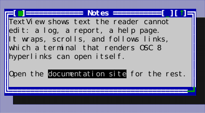
The compiled scene below is the source of this figure.
view->set_spans({
    widgets::TextSpan{"TextView shows text the reader cannot edit: a log, a report, a help "
                      "page.\n"
                      "It wraps, scrolls, and follows links, which a terminal that renders "
                      "OSC 8 hyperlinks can open itself.\n"
                      "\n"
                      "Open the ",
                      Attr{}, std::nullopt},
    widgets::TextSpan{"documentation site", Attr{}, std::string("https://cklukas.github.io/ckVision/")},
    widgets::TextSpan{" for the rest.", Attr{}, std::nullopt},
});
view->set_wrap_mode(widgets::WrapMode::Word);
view->set_vertical_scrollbar_policy(widgets::ScrollbarPolicy::Auto);
view->on_link_activate = [](const std::string& target) { (void)target; };
TreeNode
Header: include/cvision/widgets/tree_view.hpp. A hierarchy node with label,
children, expansion state, and optional client data.
TreeItem
Header: include/cvision/widgets/tree_view.hpp. The compact label,
known-children state, and optional client payload returned for one requested
TreeModel node. It carries neither child storage nor expansion state.
TreeModel
Header: include/cvision/widgets/tree_view.hpp. A caller-owned, synchronous
stable-ID hierarchy provider. It supplies root, parent, child-index, and item
lookups so TreeView can retain view-owned selection and expansion across a
refresh without enumerating the whole forest. See Data views.
TreeView
Header: include/cvision/widgets/tree_view.hpp. Use hierarchical navigation.
Arrows select/expand, Home and End reach the first and last visible row,
PageUp and PageDown move a viewport's height, Enter activates; a press selects
(on the twisty it expands or collapses), a double click activates, and the
wheel scrolls the rows; and
on_expand_request supports lazy children. reveal_and_select(id) opens the ancestors of a materialized node
and selects it, which lets a result list or search controller navigate a tree
without synthesizing input. File Browser uses the public selection callback to
update a ListView. TreeView retains its flattened visible entries until roots
or expansion state changes, so repeated draws and navigation do not repeatedly
walk an unchanged materialized forest. TreeModel supplies the scalable,
caller-owned alternative: it keeps expansion and selection by stable item id,
and resolves only visible hierarchy paths. See Data views
for the provider contract.
TreeConnectorStyle::Outline provides the compact classic terminal-outline
appearance: ─+ for groups, ── for leaves, and │ ancestry guides.
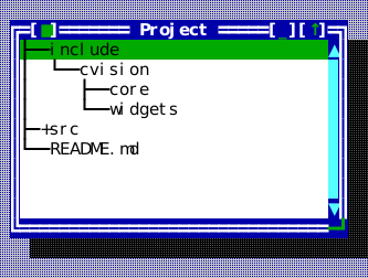
The compiled scene below is the source of this figure.
widgets::TreeNode core;
core.label = "core";
widgets::TreeNode widgets_dir;
widgets_dir.label = "widgets";

widgets::TreeNode cvision;
cvision.label = "cvision";
cvision.expanded = true;
cvision.children = {std::move(core), std::move(widgets_dir)};

widgets::TreeNode include;
include.label = "include";
include.expanded = true;
include.children.push_back(std::move(cvision));

widgets::TreeNode src;
src.label = "src";
src.children_known = false;  // an expander, with the listing not yet done

widgets::TreeNode readme;
readme.label = "README.md";

tree->set_roots({std::move(include), std::move(src), std::move(readme)});
tree->set_connector_style(widgets::TreeConnectorStyle::Outline);
tree->on_expand_request = [](widgets::TreeNode& node) {
    (void)node;  // fill node.children in place; the tree redraws with them
};
tree->on_activate = [](widgets::TreeNode& node) { (void)node; };
FrameSlot
Header: include/cvision/widgets/window.hpp. Chooses a Window frame overlay
edge/alignment/offset; use it for border metadata such as a current path.
Window
Header: include/cvision/widgets/window.hpp. Desktop owns modeless windows.
Their title bars move, borders resize when enabled, and a close request may be
vetoed by application policy. A resizable active window marks its bottom-right
corner with a light grip; every corner resizes diagonally, and a press on the
left, right or bottom edge resizes along that edge's own axis while the
opposite edge stays put. The top edge is the title bar and moves the window.
Each resize stops at the minimum and maximum size and at the edges of the
desktop's content area (set_move_bounds). Put one content view inside each
window. A
window using DesktopGrowPolicy::KeepFilling is permanently maximized: its
title control automatically shows the U+2195 restore glyph even though zoomed()
remains false (there is no transient geometry to restore). Its maximize/restore
control uses the theme's ckv.window.control accent while its brackets retain
the frame background and foreground.
set_content_cover() lays a second view over the content for a while — a
BigClockView, a read-only history, a "working…" sheet — without taking the
content's place: the content keeps running underneath, and the window keeps
the cover exactly on content_rect(), above the content, through every move,
resize and margin change. Because the cover is the window's own child it is
stacked with the window, so a window in front covers it too, and it goes when
the window does. content_rect() is in the window's own coordinates, which is
why a cover is not a desktop popup placed there by hand.
A third control, [_], sits immediately left of the maximize/restore one and
minimizes the window — set_minimized(true), which is what a click on it
does. A minimized window is hidden but still listed in its Desktop's
windows(): that listing is how a reader gets it back, from the window
switcher bar, while every tiling, the grid, the cascade, the next/previous
cycle and filled_tile_fractions() step over it. Restoring returns the
window's bounds, its place in the z-order and its zoom exactly — a window
minimized while maximized comes back maximized — because minimizing disturbs
none of the three, so there is nothing to remember and replay. Restoring does
not activate: Desktop::activate() does both, and that is the call a bar
entry, a window number or a menu item makes.
The control appears from 14 columns wide, where the arithmetic clears the
close control, and — like the maximize/restore control — not at all on a
fixed-size window. set_minimizable(false) takes it off a resizable window
that must not be hidden; Desktop's modal presentation does exactly that,
since hiding the one window accepting input would leave an application
answering nothing.
Frame line sets. set_frame_lines() chooses the border's line set:
FrameLines::ByActivation (the default — double while active, single while
not, the classic mark for the window being worked in), or one set for both
states, Single, Double or Rounded (light lines with the rounded corners
U+256D–U+2570). The grips follow the frame, so a rounded window keeps rounded
grips, and a minimized window parks as a row in its own inactive line set. A
window that chooses one set for both states shows its activation by colour
and weight alone. The choice is per window rather than a theme entry, because
a theme is a table of styles (D-007).
The keyboard move/size mode. The standard size_move command (Ctrl+F5)
puts the active window into a mode in which the arrow keys move it one cell
and Shift+arrow resizes it by its bottom-right corner — Right and Down grow
it, Left and Up shrink it. Enter keeps the result and Esc restores the bounds
the mode began with; every other key is swallowed. The frame holds the
keyboard for the duration — it takes the focus from the content, so a list's
Down or an editor's Left cannot intercept the arrows, and hands it back when
the mode ends — and its border wears ckv.window.frame.moving. A pointer
press, losing activation or focus, or minimizing also ends the mode, keeping
the new bounds. Moving needs movable(), resizing resizable(), and the same
minimum size and desktop edges hold as for the pointer. The command also runs
while a modal dialog is up, and then moves that dialog.
Window::enter_move_size_mode() is the call behind it.
set_chrome_background_override(color) replaces only the background used by
the frame, title, controls, footer, and uncovered interior. Theme foregrounds
and attributes remain intact. Use it when that surrounding colour is runtime
state—such as an emulated display's overscan colour—and clear it with
std::nullopt to return to the active or inactive window role.
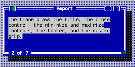
The compiled scene below is the source of this figure.
auto frame = std::make_unique<widgets::Window>("Report");
frame->set_bounds(Rect{6, 3, 44, 9});
frame->set_footer("2 of 7");
frame->set_min_size(Size{20, 5});
frame->set_minimizable(true);
frame->set_resizable(true);
frame->close_request = [] {
    return false;  // veto: something is unsaved
};
frame->set_content(std::make_unique<ui::View>());
widgets::Window* window = stage.desktop().add_window(std::move(frame));
Showing where a window went — the minimize flight
Minimizing can be shown rather than merely done: the frame shrinks and flies to the row the window will live in, and back out of it on restore. It is off until a host says where a hidden window goes, so nothing changes for an application that does not ask.
desktop.set_minimize_target_provider([&bar](widgets::Window& window) {
    return entry_rect_for(bar, window);           // std::optional<Rect>, desktop-local
});
desktop.set_minimize_animation_duration(180'000'000);   // the default; 0 disables
A provider rather than a fixed destination, because a Desktop does not know
what lists its windows — a taskbar, a window-list dialog and an application
with no listing at all each answer differently, and one of the answers is
nullopt ("nowhere to fly to", which is also what a window on another page of
a PagedStrip says). The rect is in the same coordinate frame as
Window::bounds(), and is asked for when the flight starts rather than
remembered: a taskbar row moves as its neighbours come and go, and a
remembered rectangle is how an effect flies to where a button used to be.
It is asked once per flight, though, and flying to that one answer is only
safe while a window changing state does not move its own row. That is the
host's property rather than the Desktop's: WindowSwitcherBar holds it
deliberately — its three status glyphs are one cell each, so a minimize cannot
re-flow the row the flight is aimed at. A listing that does re-flow on a state
change would leave the decoration ending where the window is not, which reads
as a rendering glitch rather than as the layout change it actually is.
The end state never comes from the frames. Window::set_minimized applies
the whole of it — hidden, invisible, bounds untouched — and notifies
afterwards, so the flight starts from a window whose state is already settled
and only draws where it went. Everything the constraint list asks for follows
from that: a host that never gets a timer tick still ends with the window
hidden, set_minimize_animation_duration(0) is a complete disable that does
not even call the provider, and finish_minimize_animation() — which an
application calls from wherever it sees a keystroke — stops a decoration
rather than resolving a half-applied change. See
Animation for the mechanism and the decision log D-060 for why it is
built this way round.
The decoration is a popup like any other: topmost, its own compositor layer, added when a flight starts and removed when it ends. It answers no input and takes no focus, because the desktop beneath it is already in its end state and a click it swallowed would be one stolen from a window the reader can see.
Animation
Header: include/cvision/ui/animation.hpp. One bounded, interruptible run of
frames over the injected Clock — and the whole of what animation means in
this toolkit. There is no scene graph of animated properties, no timeline and
no implicit transitions on setters: a duration, a callback that receives
progress in [0, 1], and a callback that says the run is over.
ui::Animation animation;                     // usually a member, not a local
animation.start(app, 180'000'000,
                [&](double progress) { move_the_decoration(progress); },
                [&] { take_the_decoration_down(); });
animation.finish();                          // ends it now; the teardown still runs
Three rules make it safe to build on:
- Progress comes from the clock, never from a frame count. A host that delivers half the frames sees the same run in the same wall time, covering more ground per frame; a host that delivers none sees it end at its deadline having drawn nothing. Advancing a fixed step per tick instead would turn a slow terminal into slow motion and leave the effect outliving the thing it described.
on_finishedruns exactly once, for every ending — completed, cut short, or a duration of zero. An effect therefore has one place to tear its decoration down and cannot leak one by ending along a path its author forgot. Destruction is the sole exception and is silent: an owner being destroyed is already tearing down.- It never owns the end state. The caller applies the end state first and then, optionally, animates. Nothing downstream can depend on a frame ever being drawn — which is what makes "interruptible" cheap rather than delicate, since there is no half-applied state for an interruption to resolve.
A duration of zero is a run that is already over: on_finished and no frames
at all. That is the whole of "animations off", answered once here rather than
by a branch at every call site.
WindowHandle
Header: include/cvision/widgets/window.hpp. Stable window identity used for
activation/listing operations without exposing ownership.
Window list dialog
Header: include/cvision/widgets/window_list_dialog.hpp. The standard typed
dialog for choosing, activating and closing Desktop windows; use its
presentation alias and result enum rather than building a one-off window
list. Desktop presents it for the standard window_list command.
It lists every window but itself in the desktop's own order, and follows the
desktop while it is up. Typing over the list filters it: each character
goes to the filter line above, the list keeps only the titles containing it
(ASCII letters compared without case), and Backspace widens it again. Escape
clears a filter first and otherwise dismisses the dialog. Enter, a double
click or the default Switch To button activates the window under the
cursor, closes the list, and hands the focus to the view that window last had
(D-107), not back to where the list was invoked. Delete or Close Window asks that window to
close through its own vetoable Window::close() — an editor with unsaved
work refuses or asks exactly as it would from its frame — and the list stays
up, dropping the window once it has left the desktop. Both buttons are
disabled while nothing is listed.
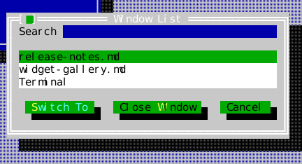
The compiled scene below is the source of this figure.
widgets::WindowListDialogPresentation list =
    widgets::present_modal_window_list_dialog(stage.desktop(), stage.app(), stage.roles());
list.set_completion_handler([](widgets::WindowListDialogResult result) { (void)result; });
Theme editor dialog
Header: include/cvision/widgets/theme_editor.hpp. The standard dialog that
lets a reader restyle an application: every role of the theme's flat role
table, sorted by name so that each family (ckv.window.*) reads as one group,
with the style it resolves to; typed editors for the role under the cursor —
default, palette or RGB for each colour, a check box per attribute, and the
underline's shape and its own colour, editable while Underline is checked —
and a live preview that draws the role's own name in its style beside a
label, a field, buttons, a check box and a list, all in the edited theme. It
returns the edited theme as a value and applies nothing itself; see
Themes and rendering for the whole
round trip, saving included.
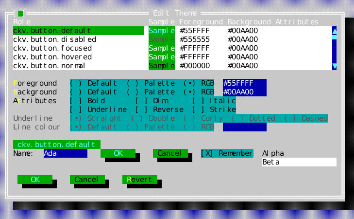
The compiled scene below is the source of this figure.
widgets::ThemeEditorPresentation editor =
    widgets::present_modal_theme_editor(stage.app().theme(), stage.app(), stage.desktop(), stage.roles());
editor.set_completion_handler([&app = stage.app()](widgets::ThemeEditorResult result) {
    if (result.theme) app.set_theme(*result.theme);
});
ThemeEditorResult
The theme editor's answer: theme holds the edited theme when the reader
accepted, and is empty when they cancelled, closed the window or the
application quit. The theme is built over the registry of the theme the editor
opened with, and a role the reader never touched resolves exactly as before.
PagedStrip
Header: include/cvision/widgets/paged_strip.hpp. One row of variable-width
items that pages when they do not all fit, together with the chrome that
steers it. Reach for it whenever a one-row strip has more in it than a narrow
terminal can show at once — a window switcher, a status row of command items,
a session list — rather than shortening every item until none of them can be
read.
Left to right, at a width that needs paging:
▼ ◁ 2/3  Item  Another item  Third   ▷
│ │  │   └── the items, as many as fit WHOLE
│ │  └────── the page index, only while there is more than one page
│ └───────── the previous-page control, live only off the first page
└─────────── the collapse toggle, only when the host asked for one
An item source is the whole of what the strip does not know:
auto strip = std::make_unique<widgets::PagedStrip>();
strip->set_item_source([&model] {
    std::vector<widgets::PagedStrip::Item> items;
    for (const Session& session : model.sessions())
        items.push_back({session.display_width(), session.caption(), session.current()});
    return items;
});
strip->on_item_activated = [&model](std::size_t index) { model.select(index); };
strip->refresh_items();  // whenever the model moves
Item::width is the cells the item's own content needs and is the
provider's answer, never a measurement the strip takes of Item::text: an
item that draws a status glyph before its label pays for it there and the
layout follows. The strip adds one padding cell either side and one blank
cell between items.
Paging, not eliding. An item takes its natural width and overflows onto the next page; nothing is shortened to make room. Elision survives in exactly one case: an item whose box is wider than the entire item area is alone on its page and is elided to that area, because it has nowhere else to go.
The chrome is reserved for every page alike once there is more than one, including the previous-page cell on the first page, where it is drawn blank. Items therefore keep their columns as the reader pages, and which items land on which page is a pure function of the width and the item widths — paging forward and back returns the reader to the set they came from. Where the row is too narrow to carry all of it, the chrome is given up in order of what it costs the reader: the page index first (it is information; the controls are function), then the collapse toggle, then the controls themselves.
Revalidation. refresh_items() recomputes the pages on every change,
because the item set moves underneath — in a terminal multiplexer a session
opens or ends at any moment. A current page that no longer exists falls back
to the last one that does, rather than showing a blank row under a 3/2
index; a page that survives is kept, so removing an item from an earlier
page does not carry the reader somewhere they did not ask to go. Both
on_page_changed and page() report the result.
The collapse toggle collapses nothing. set_collapsible(true) buys the
column; the toggle then draws ▼ while expanded and ▲ while collapsed,
reports through on_collapse_changed, and answers collapsed(). What
collapsing means — a footer that goes away, a second docked row — is the
host's other chrome, and a widget that reached out to hide a sibling would be
deciding something that is not its own. The strip's own geometry never
changes with the flag.
All four steering glyphs are one column wide by ckv::text, this library's
own width authority: ▼ U+25BC, ▲ U+25B2, ◁ U+25C1 and ▷ U+25B7 are
East Asian Ambiguous, which D-019 resolves to one column, and none of them
is Extended_Pictographic, so no variation selector can widen one into an
emoji. The black left/right triangles U+25C0/U+25B6 are
Extended_Pictographic and are deliberately not used: a two-cell triangle
would shear the row it is meant to be steering.
Keyboard: none, deliberately. A strip is chrome, and its items are reached by whatever commands the host already binds to them.

The compiled scene below is the source of this figure.
auto* strip = stage.desktop().dock_bottom(std::make_unique<widgets::PagedStrip>());
// The strip pulls its items rather than being handed them: a host
// whose model moved calls refresh_items() and the source is asked
// again.
strip->set_item_source([] {
    std::vector<widgets::PagedStrip::Item> items;
    for (const auto& [text, selected] : std::initializer_list<std::pair<const char*, bool>>{
             {"editor", true}, {"shell", false}, {"monitor", false},
             {"release notes", false}, {"changelog", false}}) {
        widgets::PagedStrip::Item item;
        item.text = text;
        // The provider's own answer, never a measurement the strip takes
        // of `text`: an item carrying a leading glyph says so here.
        item.width = static_cast<int>(item.text.size());
        item.selected = selected;
        items.push_back(std::move(item));
    }
    return items;
});
strip->on_item_activated = [](std::size_t index) { (void)index; };
strip->on_collapse_changed = [](bool collapsed) { (void)collapsed; };
WindowSwitcherTarget
Header: include/cvision/widgets/window_switcher_bar.hpp. The window one
switcher-bar row stands for, and the way to run something against that
window from a menu built elsewhere. bind(f) returns the callback
MenuItem::action carries, checked against the window's own liveness token
and against its still being listed before f runs. Reach for it — not
MenuItem::command — whenever a menu item concerns a window other than the
one in front: command dispatch has no target, and every standard
window-management handler a Desktop installs acts on active_window(), so
a Close chosen from a background row would close the wrong window.
MinimizedWindowStub
Header: include/cvision/widgets/minimized_window_stub.hpp. The one row a
put-away window leaves behind: its own top frame, rolled up and parked along
the bottom of the desktop.
┌[■]── config.yaml ──[↑]┐
A Desktop creates, places and destroys these itself whenever its
minimized_window_placement() is Parked, which is the default — an
application never constructs one. [■] closes the window through its own
close_request, so a parked editor with unsaved changes still gets to ask;
[↑], the caption, or Enter on a stub reached by Tab brings the window back
through Desktop::activate, which restores it on the way to the front
(D-056). Both mouse controls arm on the press and decide on the release,
exactly like the frame's own: the pressed face shows while the pointer is
over the control, and releasing anywhere else takes the press back. The
keyboard follows Button's rule (D-055): on a session whose verified key
enhancements report releases, Enter or Space arms and the key coming back
up restores — Escape or focus moving away in between takes it back — and on
a session that cannot report a release the press acts at once, held
visibly down for a moment. It draws in the window roles — ckv.window.frame.inactive,
ckv.window.title.inactive and ckv.window.control — so a theme that
retints inactive frames retints these with them.
The stub is a popup, not an ordinary child: it is drawn above the windows, because a parked window that a maximized neighbour could cover would be back where it started. The window behind it is untouched — hidden, with its bounds, zoom state and z-order exactly as they were — which is why restoring replays nothing.
The three placements a host chooses between (D-064):
MinimizedWindowPlacement | What a minimized window leaves on screen |
|---|---|
Parked (default) | A stub on the desktop's bottom edge |
HostListed | Nothing — the host lists its own windows, e.g. with a WindowSwitcherBar |
Disabled | Nothing, and no window offers the _ control at all |
The compiled scene below is the source of this figure.
// An application never constructs one: a Desktop whose placement is
// Parked puts a stub up when a window is minimized, and takes it down
// again when the window comes back.
stage.desktop().set_minimized_window_placement(
    widgets::MinimizedWindowPlacement::Parked);
stage.desktop().windows().front()->set_minimized(true);
stage.desktop().finish_minimize_animation();
WindowSwitcherBar
Header: include/cvision/widgets/window_switcher_bar.hpp. One row listing
every open window by title and by state, right-click for a host-supplied
context menu, the arrangement a desktop taskbar uses. The active window's
entry is drawn in the theme's ckv.statusline.selected; the rest, and the
bar itself, in ckv.statusline.normal.
Each row carries a status glyph one space left of its title, and a left click does what that glyph promises (D-059):
| Glyph | Status | What a left click does |
|---|---|---|
▮ | Active | minimizes the window the reader is in |
▯ | Visible | activates and raises a window that is behind |
▄ | Minimized | brings a window that was put away back, in front |
status_glyph(Status) is the one place the three shapes are spelled, so a
legend or a host's own listing names the same ones the bar draws. A window
whose minimizable() is false is never minimized from its row — its frame
draws no _ control, and the bar is not a second route past that gate.
WindowSwitcherBar(desktop) wires the common case: that desktop's
windows(), their title(), its active_window(), Window::minimized(),
and activate() as the click action. Each is replaceable —
set_window_source, set_label_provider, set_active_provider,
set_minimized_provider, set_activate_action, set_minimize_action,
set_context_menu_provider — so an application whose notion of a window is
its own keeps the row, the layout, the elision and the input handling. The
two actions are separate on purpose: a host that installs its own activate
action to move the keyboard with the window keeps the three transitions
above without re-deriving which one it is looking at.
set_context_menu_provider is the only one with no default: what belongs on
that menu is the application's vocabulary, not the library's.
Dock it after the status line: each Desktop edge holds a stack, the first
view docked against the edge and each later one inward of it, so the bar sits
just above the status line:
desktop.dock_bottom(std::make_unique<widgets::StatusLine>());
desktop.dock_bottom(std::make_unique<widgets::WindowSwitcherBar>(desktop));
Desktop::content_area() — and with it the rectangle a maximized window is
zoomed into — excludes both rows.
Too narrow for every title, the bar pages rather than shortening every
name: it derives from PagedStrip, which owns the layout, the
page controls, the page index and the collapse toggle. Every window keeps a
row — dropping one would make that window unreachable from the very bar that
exists to reach it — but the row it keeps may be on another page. entries()
still lists every window; drawn_entries() describes the current page only,
and entry_at() answers for that page. A bar wide enough for its windows
lays out exactly as it did before it could page: one page, no index, no
controls, and the first entry at column zero.
The collapse toggle is off until a host calls set_collapsible(true), so a
bar that never collapses pays no column for the possibility.

The compiled scene below is the source of this figure.
auto* switcher =
    stage.desktop().dock_bottom(std::make_unique<widgets::WindowSwitcherBar>(stage.desktop()));
switcher->refresh();
Damped widths
A window's title is not a stable string: a shell rewrites its caption at every prompt, a build tool writes its progress into one, an editor appends and removes a dirty marker. Each rewrite is a new measurement, so an undamped bar re-sizes that button and re-flows every button beside it several times a second — the row becomes unreadable long before the titles do, and a reader aiming at a button hits the one that took its place.
set_width_damping(grow_delay_nanos, shrink_delay_nanos) puts a floor under
how often one entry's box may change width. Both delays are measured on the
injected Clock, from that entry's last width change in either direction, so
the promise is the plain one: at most one widening per grow delay, at most one
narrowing per shrink delay. Zero for both — the default — is no damping, and
every row follows its label in the same frame.
bar->set_width_damping(1'000'000'000, 30'000'000'000); // 1 s wider, 30 s narrower
The two directions get different delays because they are not equally urgent. A box that is too narrow is showing an elided name and should widen soon; one that is too wide is showing the whole name with slack around it, which costs the reader nothing and is very often about to be needed again.
What is damped is the layout width. That is deliberate: the complaint is that the button jitters, and a button's length is the width the strip lays it out at, so damping a merely drawn width would leave the boxes shuffling underneath at exactly the rate the damping was meant to stop. Page composition therefore depends on time as well as on the labels — as it already does, since a title change re-pages. Damping does not make a pure function history-dependent; it lengthens the interval over which that function holds still, and within such an interval paging forward and back returns the reader to exactly the set they came from.
Three rules complete it:
- A window the bar has not measured before takes its natural width at once. A row that has just appeared has no previous width to flicker between.
- The label is never held back — only the box is. A name too long for the box it has is elided into it (the strip's own elision) and comes out whole when the box catches up.
settle_width(window)forgets one window's memory, so its next measurement is taken at once. It is for the change a reader made: damping absorbs what a program does to a caption, and a rename that visibly took effect half a minute later reads as a command that did not work.
A deferred change is applied by a wake-up the bar arms on the Application
timer, because nothing else re-reads the widths: a program that renames its
window once and then says nothing more would otherwise leave that name elided
into its old box for the rest of the session. The wake-up holds still while a
press is in flight (PagedStrip::press_in_flight()) and re-asks shortly
after — the strip resolves a click by index, so a box that changed width
between press and release would either move the item out from under the
pointer or spend the click on a window the reader never pointed at.
No keyboard handling, deliberately: windows are already cycled by the standard next/previous-window commands and selected by number.
The row stays correct through Desktop::subscribe_window_change rather than
by re-reading the window set as it draws.
The Workbench source shows the text/data family in the exact compiled app:
void WorkbenchApp::build_window() {
    auto window = std::make_unique<widgets::Window>("Workbench");
    window->set_bounds(Rect{2, 2, 74, 20});
    window->set_grow_policy(widgets::DesktopGrowPolicy::AnchorEdges);

    auto tabs = std::make_unique<widgets::TabControl>();
    tabs->set_bounds(Rect{0, 0, 72, 18});
    tabs_ = tabs.get();
    tabs->add_tab("&Text", build_text_page());
    tabs->add_tab("&Data", build_data_page());
    tabs->add_tab("&Help", build_help_page());
    window->set_content(std::move(tabs));
    window_ = desktop_->add_window(std::move(window));
}

std::unique_ptr<ui::View> WorkbenchApp::build_text_page() {
    auto page = std::make_unique<ui::View>();

    auto memo = std::make_unique<widgets::Memo>();
    memo->set_bounds(Rect{1, 1, 36, 6});
    memo->set_wrap_mode(widgets::WrapMode::Word);
    memo->set_text("ckVision memo\nclipboard, undo, and wrapping live here.");
    memo_ = memo.get();
    page->add_child(std::move(memo));

    auto command_label = std::make_unique<widgets::Label>("&Command:");
    command_label->set_bounds(Rect{1, 8, 10, 1});
    page->add_child(std::move(command_label));

    auto command = std::make_unique<widgets::InputLine>();
    command->set_bounds(Rect{12, 8, 24, 1});
    // The field recalls the application's own history list under this key,
    // seeded here with two earlier commands, newest last.
    app_.history().record("workbench.command", "build");
    app_.history().record("workbench.command", "test");
    command->set_history_key("workbench.command");
    command->set_text("test");
    command_input_ = command.get();
    page->add_child(std::move(command));

    auto toolbar = std::make_unique<widgets::ToolBar>();
    toolbar->set_bounds(Rect{1, 10, 34, 1});
    toolbar->set_groups({{widgets::CommandPresentation{build_command_}, widgets::CommandPresentation{console_command_}},
                         {widgets::CommandPresentation{app_.commands().standard().quit}}});
    tool_bar_ = toolbar.get();
    page->add_child(std::move(toolbar));

    auto text = std::make_unique<widgets::TextView>();
    text->set_bounds(Rect{39, 1, 30, 10});
    text->set_spans({widgets::TextSpan{"TextView links export as ", static_cast<Attr>(0), std::nullopt},
                     widgets::TextSpan{"OSC 8", Attr::Underline, std::string{"https://example.invalid/osc8"}},
                     widgets::TextSpan{" and activate deterministically.", static_cast<Attr>(0), std::nullopt}});
    text->set_current_link(0);
    text->on_link_activate = [this](const std::string& target) { last_link_ = target; };
    text_view_ = text.get();
    page->add_child(std::move(text));

    auto flow = std::make_unique<widgets::FlowView>();
    flow->set_bounds(Rect{39, 12, 30, 2});
    auto chart = std::make_shared<Image>(PixelSize{4, 1});
    for (int x = 0; x < chart->width(); ++x) chart->set_pixel(x, 0, Image::Rgba{0, 180, 120, 255});
    flow->set_document(widgets::FlowDocument{{widgets::FlowBlock{{
        widgets::FlowText{"Flow: ", static_cast<Attr>(0), std::nullopt},
        widgets::FlowText{"interactive link", Attr::Underline, std::string{"https://example.invalid/flow"}},
        widgets::FlowImage{std::move(chart), Size{7, 1}, "[chart]"},
    }}}});
    flow->on_link_activate = [this](const std::string& target) { last_link_ = target; };
    flow_view_ = flow.get();
    page->add_child(std::move(flow));

    return page;
}

std::unique_ptr<ui::View> WorkbenchApp::build_data_page() {
    auto page = std::make_unique<ui::View>();

    auto tree = std::make_unique<widgets::TreeView>();
    tree->set_bounds(Rect{1, 1, 22, 8});
    tree->set_connector_style(widgets::TreeConnectorStyle::BoxDrawing);
    widgets::TreeNode src;
    src.label = "src";
    widgets::TreeNode tests;
    tests.label = "tests";
    widgets::TreeNode project;
    project.label = "Project";
    project.children = {std::move(src), std::move(tests)};
    project.expanded = true;
    tree->set_roots({std::move(project)});
    tree_ = tree.get();
    page->add_child(std::move(tree));

    auto list = std::make_unique<widgets::ListView>(true);
    list->set_bounds(Rect{25, 1, 18, 8});
    list->set_items({"alpha", "beta", "gamma"});
    list->set_selected(0, true);
    list_ = list.get();
    page->add_child(std::move(list));

    auto table = std::make_unique<widgets::Table>();
    table->set_bounds(Rect{45, 1, 24, 8});
    table->set_columns({widgets::TableColumn{"Name", 10, 4}, widgets::TableColumn{"State", 10, 4}});
    table->set_rows({{"alpha", "ready"}, {"beta", "blocked"}, {"gamma", "done"}});
    table_ = table.get();
    page->add_child(std::move(table));

    auto combo = std::make_unique<widgets::ComboBox>(widgets::ComboBoxMode::PickOnly);
    combo->set_bounds(Rect{1, 10, 18, 1});
    combo->set_items({"debug", "release", "asan"});
    combo->set_selected_index(1);
    combo_ = combo.get();
    page->add_child(std::move(combo));

    auto progress = std::make_unique<widgets::Progress>();
    progress->set_bounds(Rect{25, 10, 32, 1});
    progress->set_fraction(0.625);
    progress->set_presentation(widgets::ProgressPresentation::Smooth);
    progress->set_show_percentage(true);
    progress_ = progress.get();
    page->add_child(std::move(progress));

    auto search = std::make_unique<widgets::SearchBox>();
    search->set_bounds(Rect{1, 12, 22, 1});
    search->set_query("alpha");
    search_box_ = search.get();
    page->add_child(std::move(search));

    auto breadcrumb = std::make_unique<widgets::BreadcrumbBar>();
    breadcrumb->set_bounds(Rect{25, 12, 30, 1});
    breadcrumb->set_segments({"workspace", "src", "widgets"});
    breadcrumb_ = breadcrumb.get();
    page->add_child(std::move(breadcrumb));

    return page;
}